Ember Sparks
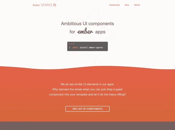
Ambitious UI components for your Ember app.
Overview
Ember Sparks is a powerful initiative designed to streamline and enhance the UI component experience in Ember applications. By leveraging ember-css-modules, it allows developers to implement a set of default components effortlessly. This means you can not only apply sensible defaults but also enjoy seamless customization for your Ember apps, making it a versatile choice for developers looking to build efficient and polished user interfaces.
The introduction of preinstalled components, alongside easy customization features, ensures that both new and experienced developers can work quickly and effectively. With Ember Sparks, modifying your app's UI has never been simpler, enabling you to focus more on functionality while maintaining a consistent design.
Features
-
Preinstalled Components: Comes with handy components like
{{input-spark}}and{{toggle-spark}}, which you can easily integrate into your templates. -
Simple Installation: A straightforward installation process that allows you to restart your app and start using the components right away.
-
Customization Ease: Offers simplified component customization through ember-css-modules, making maintenance and adjustments much easier than with typical UI libraries.
-
Extensive Documentation: Well-structured documentation provides guidance on available components and customization options for an improved development experience.
-
Community Contribution: Includes a generator for creating custom Spark components as addons, encouraging community involvement and expansion of the available components.
-
Consistent Theming: Built-in theming capabilities enable quick adjustments to the look and feel of your components, ensuring a cohesive design across your application.
-
Conventional Approach: Adheres to Ember ecosystem conventions, facilitating a smooth experience for addon authors to share and implement UI elements effortlessly.
- Ember
Ember.js is a productive, battle-tested JavaScript framework for building modern web applications. It includes everything you need to build rich UIs that work on any device.
- UI Kits & Components

A UI kit provides developers with a set of reusable components that can be easily integrated into a website or application. These components are pre-designed with consistent styling and functionality, allowing developers to save time and effort in the design and development process. UI kits can be either custom-built or third-party, and often include components for buttons, forms, typography, icons, and more.