Pxl
An adjustable framework-ish static site theme with sensible defaults and nice looks. (ˈpik-səl)
Overview
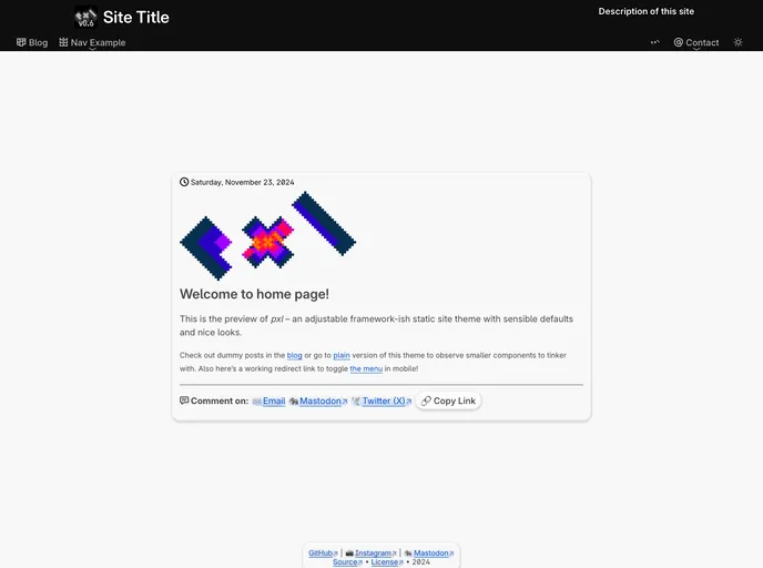
The pxl-theme is an adjustable website theme that offers sensible defaults and a visually appealing design. It is built with a mobile-first approach and focuses on responsive layouts. The theme heavily relies on HTML and CSS, while JavaScript is only used for accessibility and non-essential content. Some key features include multiple variations for the navigation component, improved legibility with vertical rhythm and modular scale, and the availability of different color palette options. The theme also offers customizable container make-ups, a CSS reset using Sanitize.css, and a scalable codebase. It is built with Gulp task runner and utilizes PostCSS plugins for writing CSS. The theme supports modern browsers released in the last two years.
Features
- Responsive layout with mobile-first approach: The theme is designed to be responsive, prioritizing mobile devices.
- Several variations for navigation component: There are multiple options available for customizing the navigation component of the theme.
- Heavily depending on HTML and CSS, leaving JS for providing accessibility and non-essential content: The theme primarily uses HTML and CSS, with JavaScript used only for accessibility and non-essential content.
- Improved legibility with vertical rhythm and modular scale: The theme focuses on legibility by utilizing vertical rhythm and a modular scale for typography.
- (Almost) every element has multiple designs to serve content in multiple ways: The theme offers different designs for various elements, allowing for flexibility in presenting content.
- Color palette options from well-known terminal colors: Users can choose from a variety of color palettes, including popular terminal colors like Solarized, Gruvbox, and One Dark UI.
- Container make-ups like shadows, border thickness, emboss effects: The theme provides options for customizing container styles, including shadows, border thickness, and emboss effects.
- Sanitize.css Reset: The theme utilizes Sanitize.css for a CSS reset, ensuring consistent styling across browsers.
- Scalable codebase, written with OOCSS, BEVM in mind: The theme's codebase is designed to be scalable, following the principles of Object-Oriented CSS (OOCSS) and Block-Element-Variable-Modifier (BEVM) methodologies.
- Custom grid layout (CSS Grid will be adapted soon): The theme includes a custom grid layout system, with plans to adopt CSS Grid in the future.
Summary
The pxl-theme is a versatile website theme that offers responsive layouts, customizable navigation options, and improved legibility through vertical rhythm and modular scale. It relies heavily on HTML and CSS, with JavaScript being used primarily for accessibility and non-essential content. The theme provides various color palette options, customizable container styles, and a scalable codebase. It is built with Gulp task runner and utilizes PostCSS plugins for writing CSS. The theme is designed to be compatible with modern browsers released in the last two years.