Dashup
React Dashboard Component
Overview
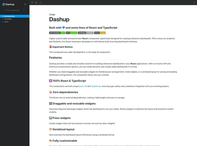
Dashup is a powerful and versatile library that allows developers to effortlessly create interactive dashboards using React and TypeScript. With a focus on performance and customization, Dashup provides a solid foundation for building visually appealing and dynamic dashboard interfaces. This library is built with simplicity in mind, making it easy for developers to integrate into their existing projects and streamline their dashboard development.
The intuitive API and extensive customization options enable developers to create dashboards that not only look great but also function seamlessly. Whether you're looking to build complex layouts or simple interfaces, Dashup can adapt to your needs, making it an essential tool for any React developer interested in dashboard creation.
Features
-
⚛️ 100% React & TypeScript: Built on React v18 and TypeScript, ensuring type safety and easy integration with existing projects.
-
🍿 Zero dependencies: Lightweight and easy to manage, without external dependencies.
-
🎛️ Draggable and resizable widgets: Easily rearrange and resize widgets on the dashboard for an optimized layout that enhances content visibility.
-
⏸️ Fixed widgets: Create unmovable widgets that maintain their position even as other widgets are adjusted.
-
🗂️ Serialized layout: Save and load your dashboard layout effortlessly with a serialized format, making it easy to retain custom setups.
-
🎨 Fully customizable: Tailor the appearance, behavior, and styling of components to align with your application's branding and requirements.
-
🔋 High performance: Implements best practices for React performance optimization to ensure smooth rendering and an enjoyable user experience.
-
📘 Storybook integration: Utilize Storybook for easy development and interactive documentation, enhancing the development process.
- React
React is a widely used JavaScript library for building user interfaces and single-page applications. It follows a component-based architecture and uses a virtual DOM to efficiently update and render UI components
- Vite
Vite is a build tool that aims to provide a faster and leaner development experience for modern web projects
- SCSS
SCSS is a preprocessor scripting language that extends the capabilities of CSS by adding features such as variables, nesting, and mixins. It allows developers to write more efficient and maintainable CSS code, and helps to streamline the development process by reducing repetition and increasing reusability.
- Dashboard

A dashboard style website template is a pre-designed layout that features a user interface resembling a control panel or dashboard. It typically includes charts, graphs, tables, and other data visualization tools that allow users to monitor and analyze data in real-time.
- UI Kits & Components

A UI kit provides developers with a set of reusable components that can be easily integrated into a website or application. These components are pre-designed with consistent styling and functionality, allowing developers to save time and effort in the design and development process. UI kits can be either custom-built or third-party, and often include components for buttons, forms, typography, icons, and more.
- Eslint

ESLint is a linter for JavaScript that analyzes code to detect and report on potential problems and errors, as well as enforce consistent code style and best practices, helping developers to write cleaner, more maintainable code.
- GitHub Pages

Gridsome is a Vue.js-based static site generator that makes it easy to build fast and flexible websites and applications by leveraging modern web technologies like GraphQL, Webpack, and hot reloading
- Storybook
Storybook is a tool for developing and testing UI components in isolation. It provides a sandbox environment where you can experiment with different props and states to see how your component responds.
- Typescript

TypeScript is a superset of JavaScript, providing optional static typing, classes, interfaces, and other features that help developers write more maintainable and scalable code. TypeScript's static typing system can catch errors at compile-time, making it easier to build and maintain large applications.