Storybook Typescript Example
Storybook example for React App based on Material-UI and TypeScript
Overview
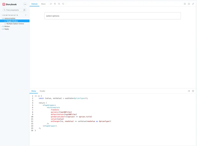
If you're looking to enhance your React application, a Storybook setup based on Material-UI and TypeScript is an excellent choice. This powerful tool allows developers to create isolated components and visualizations of their React components, making it easier to build and test UIs in a modular fashion. The integration of Material-UI ensures that your components are not only functional but also visually appealing and consistent with Google's Material Design guidelines.
Getting started is a breeze, and with simple commands, you can both initiate your development environment and deploy your Storybook to GitHub Pages. This seamless workflow is a great advantage for developers who want to focus on creating and showcasing their components.
Features
- Easy Setup: With just a few commands, setting up your Storybook environment is quick and straightforward.
- Component Isolation: Develop and test components in isolation from the rest of your application, allowing for focused development.
- Material-UI Integration: Utilize a well-designed UI library that conforms to Material Design principles, providing a modern look to your components.
- TypeScript Support: Write your components with type safety in mind, reducing potential runtime errors and enhancing maintainability.
- GitHub Pages Deployment: Easily publish your Storybook as a static site using optimized build commands, making it accessible for sharing and feedback.
- Live Reloading: Experience immediate feedback as you develop, thanks to hot reloading features that keep your workspace responsive.
- Interactive Documentation: Create rich documentation alongside your components, allowing users and developers to explore the features and usage in a user-friendly manner.
- React
React is a widely used JavaScript library for building user interfaces and single-page applications. It follows a component-based architecture and uses a virtual DOM to efficiently update and render UI components
- Styled Components
Styled Components is a popular library for styling React components using CSS syntax. It allows you to write CSS in your JavaScript code, making it easier to create dynamic styles that are specific to each component.
- Material UI
material-ui adds classes to Tailwind CSS for all common UI components. Classes like btn, card, etc. This allows us to focus on important things instead of making basic elements for every project.
- GitHub Pages

Gridsome is a Vue.js-based static site generator that makes it easy to build fast and flexible websites and applications by leveraging modern web technologies like GraphQL, Webpack, and hot reloading
- Material Design

Material Design is a design system developed by Google that provides a set of guidelines, components, and tools for creating visually appealing and functional user interfaces. Material Design is designed to be flexible and customizable, making it a great choice for a wide range of applications and use cases.
- Storybook
Storybook is a tool for developing and testing UI components in isolation. It provides a sandbox environment where you can experiment with different props and states to see how your component responds.
- Typescript

TypeScript is a superset of JavaScript, providing optional static typing, classes, interfaces, and other features that help developers write more maintainable and scalable code. TypeScript's static typing system can catch errors at compile-time, making it easier to build and maintain large applications.