Responsive Miller Column
jQuery plugin that implements Miller Columns with responsive design
Overview:
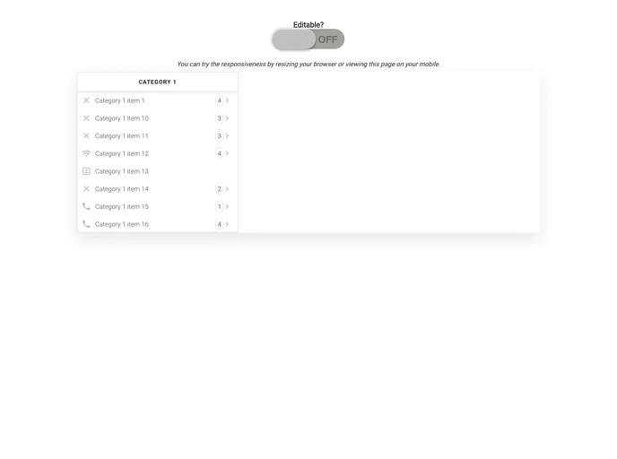
The responsive-miller-column is a jQuery plugin that implements Miller Columns with responsive design. Miller columns are a browsing/visualization technique that can be applied to tree structures. The columns allow multiple levels of the hierarchy to be open at once, providing a visual representation of the current location. This plugin was inspired by techniques used in the Smalltalk browser and was independently invented by Mark S. Miller in 1980 at Yale University. It has since been used in various projects, including Project Xanadu, Datapoint, and NeXT.
Features:
- Responsive Design: The plugin is designed to work in a responsive manner, adapting to different screen sizes.
- Editable Miller Column: The miller column can be set as editable, allowing users to add, edit, and delete category items.
- Cascading Tree Visualization: The Miller Columns provide a visual representation of the hierarchy, with multiple levels open at once.
- Event Emitters: The plugin emits events for various actions such as selecting an item, adding an item, editing an item, and deleting an item.
- Accepts Any JS Object: The plugin can accept any JavaScript object as long as it contains the required properties defined within the Category and CategoryItem classes.
Summary:
The responsive-miller-column is a jQuery plugin that implements Miller Columns, a browsing/visualization technique for tree structures. It provides a responsive design, allowing the Miller Columns to adapt to different screen sizes. The plugin supports editable Miller Columns, accepts any JavaScript object as input, and emits events for various actions such as selecting, adding, editing, and deleting category items. It provides a convenient way to organize and navigate hierarchical data.
- Material UI
material-ui adds classes to Tailwind CSS for all common UI components. Classes like btn, card, etc. This allows us to focus on important things instead of making basic elements for every project.