Astro Portfolio Starter
A simple portfolio and blog theme for Astro powered by Tailwind CSS
Overview:
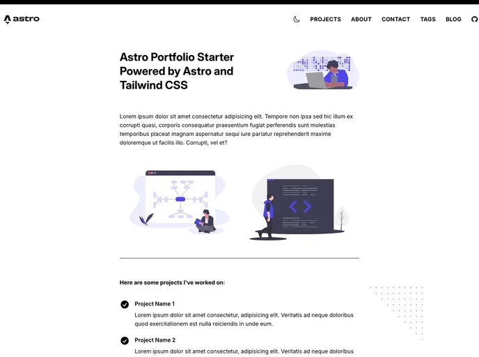
The Astro Portfolio Starter is a simple portfolio and blog theme designed for use with Astro. It features a clean and minimal design and utilizes Tailwind CSS with the Astro integration. The theme also includes a blog with MDX markdown content for posts, along with support for Vue and React components directly within the Markdown. It also includes a theme switcher with Light and Dark Mode, view transitions using Astro's implementation, tags for posts, basic pagination, syntax highlighting, and illustrations from unDraw. The theme is based on a previous project built in Gridsome.
Features:
- Clean and minimal design
- Tailwind CSS using the Astro integration
- Blog with MDX markdown content for posts
- Supports Vue and React components directly within the Markdown
- Theme Switcher with Light and Dark Mode
- View Transitions using Astro's implementation
- Tags for posts
- Basic pagination
- Syntax highlighting
- Illustrations from unDraw
- 404 Page
Summary:
The Astro Portfolio Starter is a theme designed for use with the Astro framework. It offers a clean and minimal design, support for Tailwind CSS, and includes features such as a blog with MDX markdown content, support for Vue and React components, a theme switcher with Light and Dark Mode, view transitions, tags for posts, basic pagination, syntax highlighting, and illustrations from unDraw. It is a versatile theme that can be used to showcase portfolios and create blogs with ease.
- Astro
Astro is the all-in-one web framework designed for speed. Pull your content from anywhere and deploy everywhere, all powered by your favorite UI components and libraries.
- Tailwind
Tailwind CSS is a utility-first CSS framework that provides pre-defined classes for building responsive and customizable user interfaces.
- Blog

Blog websites feature posts written by one or more authors, organized by categories and tags, with a section for comments and archives sorted by date or topic. Additional features may include search bar, social media sharing, subscription or RSS feed, about and contact pages, and visual content.
- Portfolio

A portfolio website is a type of website that showcases an individual's or a company's work, skills, and accomplishments. It typically includes a gallery of images or videos, case studies, and client testimonials to provide potential clients or employers with a comprehensive overview of their experience and expertise.
- Dark Mode
Dark mode is a user interface option that uses a dark color scheme instead of light. It reduces eye strain and improves visibility in low-light conditions. Implementing dark mode in a website or application involves updating the styles and color palette to support both light and dark modes.
- MDX

MDX is a format that allows developers to write JSX within Markdown documents, combining the power of React with the simplicity of Markdown. This allows for the creation of dynamic and interactive content that can be easily shared and consumed across different platforms and devices.