React Crafitify
React-Crafitify is a versatile React component library designed to enhance the user interface of your web applications. With a focus on aesthetics and usability, React-Crafitify provides a collection of customizable UI components that can seamlessly integrate into your projects.
Overview
React-Crafitify is a versatile React component library tailored to elevate the user interface of your web applications. Emphasizing both aesthetics and usability, this library equips developers with a wide array of customizable UI components that can be effortlessly integrated into various projects. Whether you’re building a sleek dashboard or an engaging landing page, React-Crafitify’s offerings can enhance both the look and feel of your application.
The library stands out for its ease of use and flexibility, enabling developers to create stunning UIs without compromising functionality. With its rich set of components and intuitive customization options, React-Crafitify is suitable for both new projects and ongoing development efforts, making it a valuable addition to any React developer's toolkit.
Features
- Customizable Components: Each component can be easily tailored to fit the specific design and functionality needs of your application.
- Seamless Integration: Designed to blend effortlessly into your existing React projects, minimizing setup time and complexity.
- Focus on Aesthetics: Components are crafted with attention to visual appeal, ensuring that your application stands out.
- User-Friendly Design: Easy-to-navigate components enhance overall user experience, making applications more engaging.
- Responsive Layouts: All components are built with responsiveness in mind, ensuring optimal display across various devices and screen sizes.
- Comprehensive Documentation: Detailed guides and examples help developers quickly understand how to implement and customize components.
- Active Community Support: A growing community provides support and resources, assisting developers in troubleshooting and enhancing their implementations.
- React
React is a widely used JavaScript library for building user interfaces and single-page applications. It follows a component-based architecture and uses a virtual DOM to efficiently update and render UI components
- SCSS
SCSS is a preprocessor scripting language that extends the capabilities of CSS by adding features such as variables, nesting, and mixins. It allows developers to write more efficient and maintainable CSS code, and helps to streamline the development process by reducing repetition and increasing reusability.
- Styled Components
Styled Components is a popular library for styling React components using CSS syntax. It allows you to write CSS in your JavaScript code, making it easier to create dynamic styles that are specific to each component.
- Docker

A website that uses Docker for containerization to streamline development, testing, and deployment workflows. This includes features such as containerization of dependencies, automated builds and deployments, and container orchestration to ensure scalability and availability.
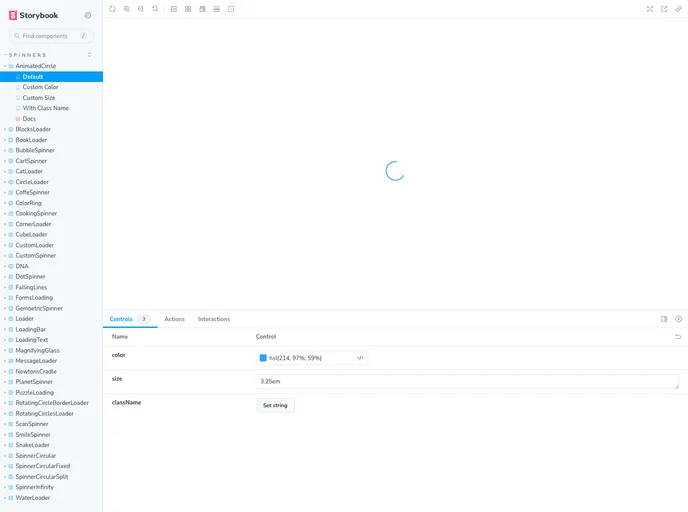
- Storybook
Storybook is a tool for developing and testing UI components in isolation. It provides a sandbox environment where you can experiment with different props and states to see how your component responds.
- Typescript

TypeScript is a superset of JavaScript, providing optional static typing, classes, interfaces, and other features that help developers write more maintainable and scalable code. TypeScript's static typing system can catch errors at compile-time, making it easier to build and maintain large applications.