Bootstrap Grid Css
The grid and responsive utilities classes extracted from the Bootstrap 4 framework, compiled into CSS.
Overview
If you're a web developer looking to implement responsive design without the additional classes and typography of Bootstrap, then Bootstrap Grid might be just what you need. This specially tailored version of Bootstrap focuses solely on the grid functionality, allowing for quick and easy integration into existing client sites that might lack responsive frameworks. The beauty of this tool is in its simplicity and effectiveness, letting you get your projects up and running without the clutter of unnecessary styles.
Bootstrap Grid is exceptionally user-friendly and designed for those who appreciate working efficiently. Whether you’re extracting the grid for a small project or implementing it on a larger scale, this tool provides the flexibility needed to maintain a responsive layout without the overhead of additional classes or components.
Features
- Lightweight Design: Focus solely on grid functionality, minimizing CSS bloat and ensuring your projects load faster.
- Responsive Utilities: Ported from earlier versions, these utilities help manage responsive visibility with ease.
- img-fluid Class: This class simplifies image responsiveness, replacing the older .img-responsive from Bootstrap 3, for easy image management.
- Custom Build Capability: Easily modify SCSS files to create a tailored Bootstrap Grid that meets your specific project needs.
- Easy Installation: Simple integration via NPM or Bower, reducing setup time for developers.
- Documentation Availability: A wealth of online resources to guide you in effectively using the Bootstrap grid system ensures you’re supported throughout your development process.
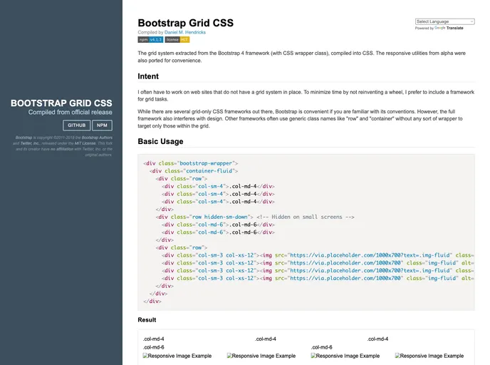
- Basic Usage Wrapper: Wrap your grid in the .bootstrap-wrapper class to prevent conflicts with other libraries, making integration seamless and straightforward.
- Compilation Tools Friendly: Works well with tools like Gulp or npm for those who prefer automated tasks in their workflow, enhancing productivity.
- Bootstrap
Bootstrap is the most popular CSS Framework for developing responsive and mobile-first websites.
- Gulp

Gulp.js is an old but popular site building tool that automates various repetitive development tasks in web development, such as compiling Sass, minifying JavaScript, and optimizing images.