Custom ReactJS Dropdown Components
Custom dropdown components for ReactJS
Overview
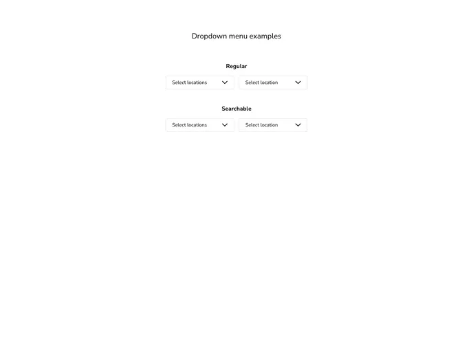
This dropdown menu package for ReactJS offers a robust solution for developers looking to implement custom dropdown functionality in their applications. Featuring both single-selection and multi-selection options, it caters to various user needs while ensuring an intuitive interface. With versions starting from 1.1.7, users are advised to take note of the breaking changes introduced in this release to avoid compatibility issues.
The flexibility of this package allows for dynamic imports, making it suitable for frameworks like NextJS. Its selection of features provides developers with the tools they need to create a streamlined and customizable dropdown experience.
Features
- Single and Multi-selection: Offers both single and multiple item selection capabilities, allowing users to choose the option that fits their requirements.
- Searchable Dropdowns: The
searchableprop enables a search bar within the dropdown, improving user experience when dealing with large lists. - Customizable Styles: You can pass a
stylesobject to define basic styling, while also utilizing class names for more complex design needs. - Dynamic Import for NextJS: Supports dynamic importing, which is particularly useful for projects built with NextJS, enhancing the performance of your application.
- Initial Selection Control: The
selectprop allows you to define items that are selected by default, ensuring smoother user interactions from the start. - Custom Arrow and Check Icons: You can specify your own icons for the dropdown's arrow and selection using the
arrowUpIcon,arrowDownIcon, andcheckIconprops for a personalized touch. - Ref Support for Internal Functions: By passing a ref, you can easily access internal functions, giving you more control over the dropdown's behavior.
- Plural Title Management: The package intelligently pluralizes the title for multi-selection modes, with the option to specify a custom plural title if needed.
- React
React is a widely used JavaScript library for building user interfaces and single-page applications. It follows a component-based architecture and uses a virtual DOM to efficiently update and render UI components
- SCSS
SCSS is a preprocessor scripting language that extends the capabilities of CSS by adding features such as variables, nesting, and mixins. It allows developers to write more efficient and maintainable CSS code, and helps to streamline the development process by reducing repetition and increasing reusability.
- Eslint

ESLint is a linter for JavaScript that analyzes code to detect and report on potential problems and errors, as well as enforce consistent code style and best practices, helping developers to write cleaner, more maintainable code.
- Stylelint
Stylelint is a modern linter for CSS that helps you avoid errors and enforce consistent styling conventions. It provides rules for detecting errors and warnings, and can be configured to match your specific project's requirements.
- Webpack

Webpack is a popular open-source module bundler for JavaScript applications that bundles and optimizes the code and its dependencies for production-ready deployment. It can also be used to transform other types of assets such as CSS, images, and fonts.