Sidebars
Minimal implementation of responsive sidebars
Overview
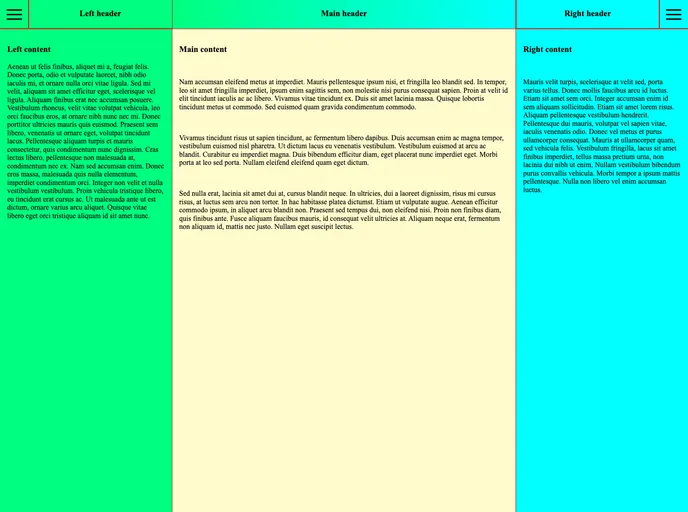
The Responsive Sidebars project explores innovative solutions for implementing user-friendly sidebar navigation that adapts seamlessly to different screen orientations. Balancing simplicity with functionality, this project emphasizes a clean design that enhances the user experience, allowing sidebars to interact with content dynamically without overwhelming users with unnecessary distractions.
The implementation strives for an efficient approach, ensuring that sidebars behave consistently across both landscape and portrait modes. The focus is on keeping interactions smooth and intuitive, avoiding common pitfalls that can frustrate users, such as sudden content rearrangements or annoying sidebar triggers. The technical choices made in this design are commendable, showcasing flexibility without sacrificing usability.
Features
- Responsive Design: Adjusts behavior based on screen orientation; sidebars push main content in landscape mode and overlay it in portrait mode.
- Minimalist Code: Simplified and organized code structure to enhance readability and maintenance, fostering a focus on sidebar mechanics.
- Flexbox Implementation: Utilizes flexbox layout for adaptive behavior, allowing sidebars to interact fluidly with main content.
- Fixed-Width Sidebars: Ensures that sidebars do not rearrange their content while opening, providing a stable visual experience.
- Two Transition Effects: Implements distinct transitions for landscape sidebar opening and sliding fixed-width child divs in and out of view.
- User-Centric Design: Prioritizes the user experience by making sidebar triggers stationary, eliminating user annoyance during interaction.
- Multiple Branches for Flexibility: Explores alternatives including CSS grid and absolute positioning, demonstrating versatility in implementation approaches.
- Gatsby
GatsbyJS is a free and open-source static site generator based on React. It uses a modern development stack including Webpack, GraphQL, and modern JavaScript and CSS frameworks. It also provides a rich set of plugins, starters, and themes.
- React
React is a widely used JavaScript library for building user interfaces and single-page applications. It follows a component-based architecture and uses a virtual DOM to efficiently update and render UI components
- SCSS
SCSS is a preprocessor scripting language that extends the capabilities of CSS by adding features such as variables, nesting, and mixins. It allows developers to write more efficient and maintainable CSS code, and helps to streamline the development process by reducing repetition and increasing reusability.
- GitHub Pages

Gridsome is a Vue.js-based static site generator that makes it easy to build fast and flexible websites and applications by leveraging modern web technologies like GraphQL, Webpack, and hot reloading