Angular Rangeslider
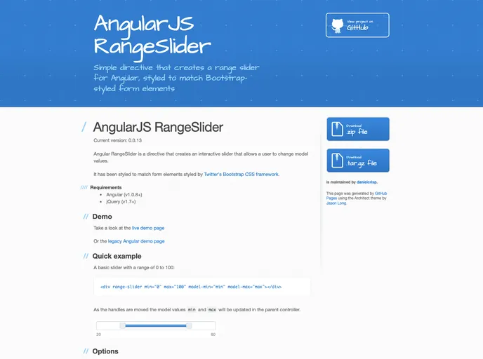
Simple directive that creates a range slider for Angular, styled to match Bootstrap-styled form elements
Overview
The Angular RangeSlider is a versatile directive designed for Angular applications that allows users to interactively adjust model values through a slider interface. It seamlessly integrates with Bootstrap's styling, ensuring consistency across your UI components. Despite being created back in 2013, this directive provides essential functionality for value selection within defined ranges, making it a useful tool for developers looking for a straightforward range selection solution.
While it may not be actively maintained, the Angular RangeSlider still presents an opportunity for custom development. Its flexibility allows users to integrate it in various ways, depending on their project needs. If you are utilizing Angular with Bootstrap, this directive can effortlessly enhance user experience, enabling intuitive interaction with numeric inputs.
Features
- Interactive Slider: Create an engaging user experience allowing real-time interaction with min and max values.
- Bootstrap Integration: Styled to harmonize with Bootstrap's form elements, ensuring a cohesive look and feel.
- Customizable Options: Supports attributes for min/max values, step increments, and orientation adjustments (horizontal/vertical).
- Filters: Incorporate built-in filters to modify the displayed values, such as currency formatting.
- Event Handlers: Capability to trigger functions upon handle movements, enhancing the interactivity of your application.
- Dynamic Value Updates: Model values are updated instantaneously as users manipulate the slider handles, providing immediate feedback.
- Prevent Equal Min/Max: An option to ensure that the minimum and maximum values remain distinct, maintaining data integrity.
- Pin Handle Customization: Disable or hide a handle as needed, providing greater control over the slider's functionality.