Neu_ui
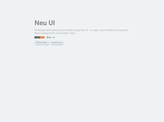
Prototype and build projects faster using Neu UI - an open source React component library designed to neumorphic style. Built using React, Styled Components, Jest and Storybook.
Overview
Neu UI is a fascinating new React component library that enables developers to prototype and build projects with ease, leveraging the unique aesthetic of neumorphism. Originally conceived as a side project, Neu UI takes inspiration from the blend of skeuomorphic and material design principles, offering a modern twist to user interface development. With a strong focus on usability and design, this library is set to revolutionize how we perceive and create UI components.
By utilizing React, Storybook for visualizing components, and Styled Components for styling, Neu UI enhances the development process while providing a sleek, modern look. Whether you're just starting to explore UI design or are a seasoned developer, Neu UI offers a robust set of tools to elevate your projects.
Features
- Neumorphic Design Aesthetic: Embraces a contemporary design style that blends depth and realism, creating visually appealing interfaces.
- React Component Library: Built on the React framework, allowing easy integration into existing projects and promoting component reusability.
- Controlled Form Components: Includes a suite of form and card components that help streamline the process of managing user inputs and data visualization.
- Storybook Integration: Visualize and develop components in isolation, making it easier to refine your designs before integration into the main application.
- Comprehensive Documentation: Offers detailed documentation that covers props, installation instructions, and guidelines for contributing, ensuring a smooth onboarding experience.
- Community Contributions: Encourages community involvement with a clear contribution guide and labels for beginner-friendly issues, fostering a collaborative atmosphere.
- MIT License: Freedom to use, modify, and distribute, ensuring that you can adapt the library to meet your specific needs.
- React
React is a widely used JavaScript library for building user interfaces and single-page applications. It follows a component-based architecture and uses a virtual DOM to efficiently update and render UI components
- Styled Components
Styled Components is a popular library for styling React components using CSS syntax. It allows you to write CSS in your JavaScript code, making it easier to create dynamic styles that are specific to each component.
- Netlify

Netlify is a cloud-based web development platform that provides a range of tools and services to help developers build, deploy, and manage modern web applications. It offers features such as continuous deployment, serverless functions, and CDN hosting, making it an ideal platform for building fast, scalable, and secure websites.
- Storybook
Storybook is a tool for developing and testing UI components in isolation. It provides a sandbox environment where you can experiment with different props and states to see how your component responds.