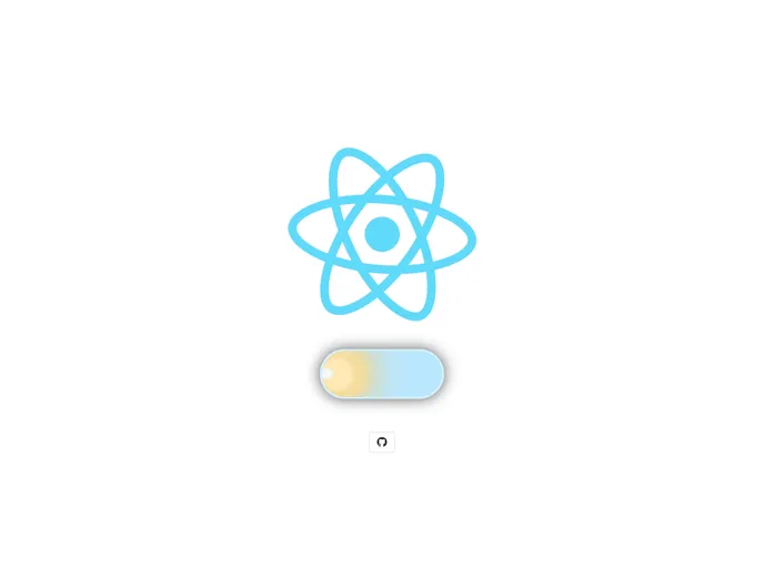
React Day And Night Toggle
Day & Night (light/dark) theme switch with pretty cool animation for React.
Overview
The React Day & Night Toggle is an innovative component that allows developers to easily implement a light/dark theme switch in their applications. With its charming animations and user-friendly design, this toggle enhances the UI experience, enabling users to seamlessly transition between themes. It pulls inspiration from Da_Woodhead's CodePen, offering a polished and well-documented solution for theme management in React.
This component not only provides functionality but also adds a visual appeal with smooth animations that engage users during the theme switch. Whether you're looking to brighten up your app or tone it down for a darker aesthetic, this toggle has you covered.
Features
-
Easy Installation: Available via npm and yarn, getting started is a breeze with simple installation commands.
-
Customizable Size: Adjust the button size with an integer value, ensuring that it fits perfectly within your design.
-
State Control: The toggle accepts an
onChangeprop for handling changes, allowing you to set the state effectively upon user interaction. -
Initial Disable State: The
startInactiveprop disables the button for 2 seconds post-render, preventing theme changes during the loading of styles. -
Animation Control: With
animationInactive, the button can be disabled during its animation, providing a smoother user experience without accidental switches. -
Dynamic Shadows: The toggle casts shadows that change according to day or night modes, enhancing visual depth in the UI.
-
Custom Class Names: Utilize the
classNameprop to apply your own styles and maintain consistency with your application's look and feel.
The React Day & Night Toggle combines functionality and aesthetics, making it a valuable addition to any developer's toolkit for creating immersive user experiences.
- React
React is a widely used JavaScript library for building user interfaces and single-page applications. It follows a component-based architecture and uses a virtual DOM to efficiently update and render UI components
- Vite
Vite is a build tool that aims to provide a faster and leaner development experience for modern web projects
- Styled Components
Styled Components is a popular library for styling React components using CSS syntax. It allows you to write CSS in your JavaScript code, making it easier to create dynamic styles that are specific to each component.
- Templates & Themes

A template or theme refers to a pre-designed layout or structure that provides a basic framework for building a specific type of application or website. It typically includes good design, placeholder content and functional features, allowing developers to customize and fill in the details according to their specific needs.
- Eslint

ESLint is a linter for JavaScript that analyzes code to detect and report on potential problems and errors, as well as enforce consistent code style and best practices, helping developers to write cleaner, more maintainable code.
- Typescript

TypeScript is a superset of JavaScript, providing optional static typing, classes, interfaces, and other features that help developers write more maintainable and scalable code. TypeScript's static typing system can catch errors at compile-time, making it easier to build and maintain large applications.