Minerva UI
Composable React UI Components
Product Analysis: Minerva UI
Overview
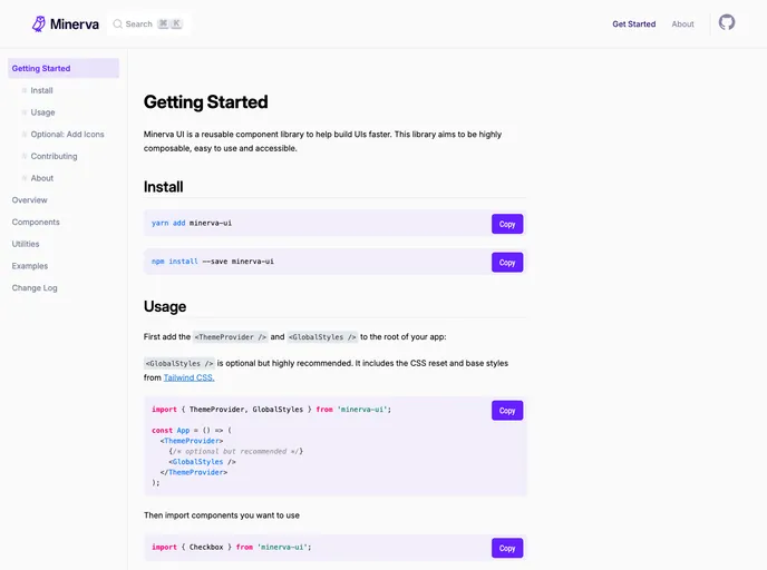
Minerva UI is a reusable component library designed to assist in building user interfaces more efficiently. This library focuses on providing highly composable, declarative, and accessible components. With an emphasis on customization and utility props, Minerva UI aims to streamline the UI development process.
Features
- Highly Composable: Minerva UI offers a wide range of components that can be easily combined to create complex UI layouts.
- Easy to Customize: With Utility Props, Minerva UI allows for quick and convenient styling of components. These utility props are inspired by Tailwind CSS, providing a familiar and flexible styling experience.
- Influences: Minerva UI draws inspiration from Ryan Florence's "Reach UI" Guidelines, offering guidelines for creating composable and declarative React APIs. Additionally, it takes notes from the utility-based CSS framework Tailwind CSS and the batteries-included React Component library Chakra UI.
Summary
Minerva UI is a reusable component library aimed at accelerating UI development. With its highly composable and customizable components, developers can easily create complex and accessible user interfaces. The library takes inspiration from various tools and frameworks to provide a seamless and efficient development experience.
- React
React is a widely used JavaScript library for building user interfaces and single-page applications. It follows a component-based architecture and uses a virtual DOM to efficiently update and render UI components
- Vite
Vite is a build tool that aims to provide a faster and leaner development experience for modern web projects
- Styled Components
Styled Components is a popular library for styling React components using CSS syntax. It allows you to write CSS in your JavaScript code, making it easier to create dynamic styles that are specific to each component.
- UI Kits & Components

A UI kit provides developers with a set of reusable components that can be easily integrated into a website or application. These components are pre-designed with consistent styling and functionality, allowing developers to save time and effort in the design and development process. UI kits can be either custom-built or third-party, and often include components for buttons, forms, typography, icons, and more.
- Eslint

ESLint is a linter for JavaScript that analyzes code to detect and report on potential problems and errors, as well as enforce consistent code style and best practices, helping developers to write cleaner, more maintainable code.
- Typescript

TypeScript is a superset of JavaScript, providing optional static typing, classes, interfaces, and other features that help developers write more maintainable and scalable code. TypeScript's static typing system can catch errors at compile-time, making it easier to build and maintain large applications.