Uikit
UI atomic component-based library with Storybook integration
Overview
CivicTheme UI Kit offers a comprehensive solution for building accessible and visually appealing web components that cater to a wide range of platforms, notably integrating seamlessly with Drupal. With its atomic design principles, the kit enables developers to create modular and reusable components, enhancing efficiency and consistency across projects. The added benefit of a strong community behind it encourages contributions and ongoing improvements, making it a robust choice for developers looking to elevate their UI design.
Features
- Atomic Design: Promotes the development of UI components as independent, reusable parts, allowing for a more organized and scalable design process.
- Accessibility Focus: Ensures components are designed with accessibility in mind, making it easier to build inclusive web applications.
- Platform-Agnostic: Works across various platforms, providing flexibility for developers to use it in different environments.
- Integrated with Drupal: Offers direct compatibility with Drupal, streamlining the development process for users of this widely-used content management system.
- Visual Regression Testing: Automatically captures screenshots of UI components and compares them to detect any visual changes during development.
- CI Integration: Supports automated visual regression tests on pull requests, simplifying quality assurance and detection of interface issues.
- Component Synchronization: Ensures consistency between different implementation styles with a strict schema for component definitions.
- Community Contributions: Actively encourages developers to contribute, either by proposing new features or fixing bugs, fostering an engaged user base.
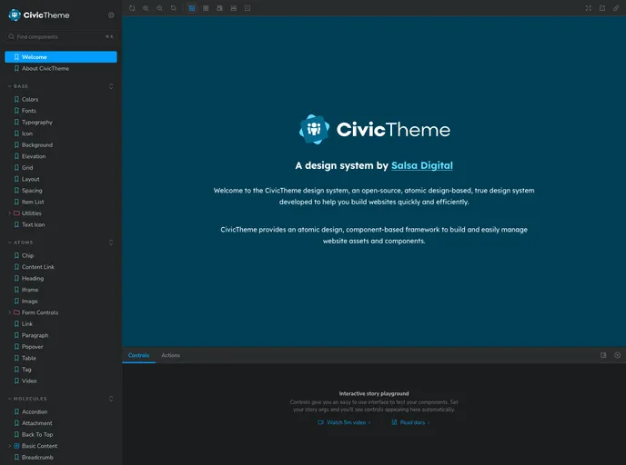
- Storybook
Storybook is a tool for developing and testing UI components in isolation. It provides a sandbox environment where you can experiment with different props and states to see how your component responds.
- Stylelint
Stylelint is a modern linter for CSS that helps you avoid errors and enforce consistent styling conventions. It provides rules for detecting errors and warnings, and can be configured to match your specific project's requirements.