Muibox
Promise-based dialog boxes (alert, confirm, prompt) using Material-UI
Overview
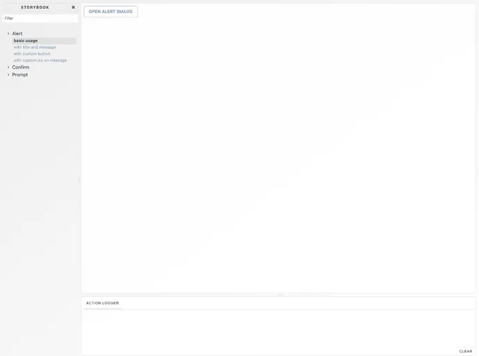
The muiboxNPM library streamlines the experience of handling dialog boxes in React applications. By utilizing Material-UI components, it provides a modern and elegant way to present alert, confirm, and prompt dialog boxes to users. This library is a great fit for developers looking to enhance user experience by adding interactive prompts and confirmations without the hassle of boilerplate code.
Setting up muiboxNPM is straightforward—simply wrap your components with the DialogProvider, and you'll be ready to use dialog boxes throughout your application. The integration with hooks allows for seamless management of dialog states and context, making it an attractive choice for React projects using version 16.8 and above.
Features
- Promise-based Dialogs: Utilize alert, confirm, and prompt dialog boxes that return promises for easier handling of user responses.
- Material-UI Integration: Enjoy built-in compatibility with Material-UI, ensuring that your dialogs have a modern look and feel consistent with the rest of your application.
- Customizable Options: Adjust dialog settings through a robust options object, allowing for tailored titles, messages, and button configurations.
- Hooks Support: Leverage the
useDialoghook to access dialog context easily, making it convenient to trigger dialogs from within functional components. - Enhanced User Actions: Specify details for positive and negative buttons, including text, color, icon, and variant, aligning them with your app's design.
- Cancel Behavior Control: Manage cancel button behavior with an option to disable the default error-throwing on cancel actions, ensuring smoother user interactions.
- Input Support for Prompts: Customize prompt dialogs with input fields, and control placeholder text as well as required fields for user input.
- Simple Setup: Get started quickly with a minimal setup process, ideal for developers aiming to implement dialogs without extensive configuration.
- React
React is a widely used JavaScript library for building user interfaces and single-page applications. It follows a component-based architecture and uses a virtual DOM to efficiently update and render UI components
- Material UI
material-ui adds classes to Tailwind CSS for all common UI components. Classes like btn, card, etc. This allows us to focus on important things instead of making basic elements for every project.
- Eslint

ESLint is a linter for JavaScript that analyzes code to detect and report on potential problems and errors, as well as enforce consistent code style and best practices, helping developers to write cleaner, more maintainable code.
- GitHub Pages

Gridsome is a Vue.js-based static site generator that makes it easy to build fast and flexible websites and applications by leveraging modern web technologies like GraphQL, Webpack, and hot reloading
- Material Design

Material Design is a design system developed by Google that provides a set of guidelines, components, and tools for creating visually appealing and functional user interfaces. Material Design is designed to be flexible and customizable, making it a great choice for a wide range of applications and use cases.