React Svg Pan Zoom
:eyes: A React component that adds pan and zoom features to SVG
Overview
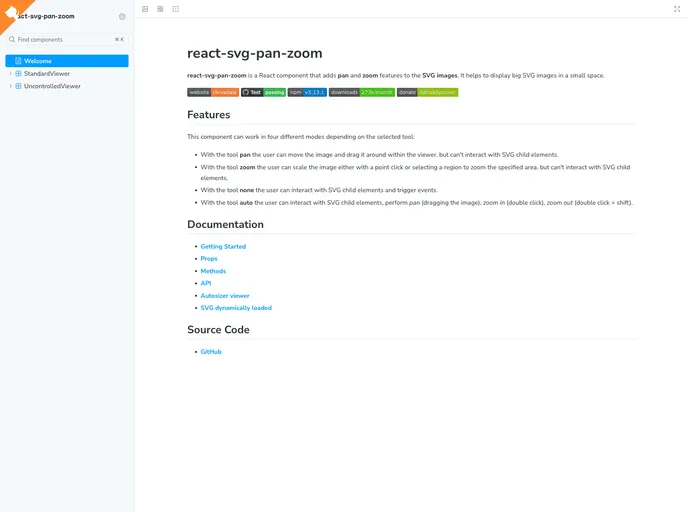
React-SVG-Pan-Zoom is a powerful component designed for React applications, allowing users to add pan and zoom functionalities to SVG images seamlessly. This component is particularly useful for displaying large SVG graphics in a limited space, making it an excellent choice for applications that require detailed visual representations, such as maps or intricate illustrations. With its intuitive interface, React-SVG-Pan-Zoom enhances user interaction, providing a rich visual experience without sacrificing performance.
The flexibility of this component is one of its standout features. It caters to different user needs by offering multiple interaction modes, allowing users to engage with the SVG in various ways. Whether you're looking to position an image, zoom in on specific details, or interact directly with the SVG's elements, this tool adapts to your requirements efficiently.
Features
- Multiple Interaction Modes: Choose from pan, zoom, none, or auto modes to customize how users interact with SVG content.
- User-Friendly Panning: Drag and move large SVG images effortlessly within the viewer without disrupting the display.
- Dynamic Zooming: Scale the SVG image with point clicks or by selecting specific areas for focused zooming.
- Child Element Interaction: Interact with SVG child elements when in 'none' or 'auto' modes, triggering events as needed.
- Comprehensive API: Access a variety of methods and props that allow for detailed customization and control over the component's functionality.
- Touch Events Support: Enhanced usability on touch devices, enabling pinch-to-zoom gestures for mobile users.
- Miniature Feature: Keep track of the overall image with a miniature view that aids in navigation and context.
- Robust Documentation: Well-structured documentation guides users through installation, usage, and customization options, making it easy to get started.
- React
React is a widely used JavaScript library for building user interfaces and single-page applications. It follows a component-based architecture and uses a virtual DOM to efficiently update and render UI components
- Storybook
Storybook is a tool for developing and testing UI components in isolation. It provides a sandbox environment where you can experiment with different props and states to see how your component responds.
- Web Components

Web components provide a way to create reusable, encapsulated UI components using standard web technologies such as HTML, CSS, and JavaScript. They allow developers to create complex UI components that can be easily shared across multiple projects and frameworks. Web components are built using four main specifications: Custom Elements, Shadow DOM, HTML Templates, and ES Modules.
- Webpack

Webpack is a popular open-source module bundler for JavaScript applications that bundles and optimizes the code and its dependencies for production-ready deployment. It can also be used to transform other types of assets such as CSS, images, and fonts.