Pro Theme
Chakra UI Pro Theme
Overview
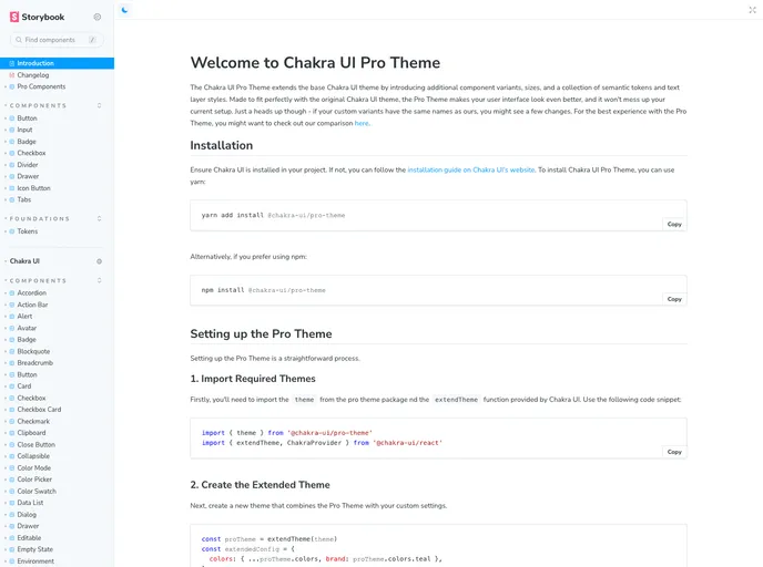
The Chakra UI Pro Theme extends the base Chakra UI theme by introducing additional component variants, sizes, and a collection of semantic tokens and text layer styles. It is designed to seamlessly integrate with the original Chakra UI theme and enhance the look of your user interface without disrupting your current setup. However, it's important to note that if your custom variants have the same names as those in the Pro Theme, you may experience some changes. For the best experience with the Pro Theme, you can refer to their comparison guide.
Features
- Extended Component Variants: The Pro Theme introduces additional component variants, allowing for more customization options.
- Expanded Size Options: With the Pro Theme, you have access to a wider range of size options for components, giving you more flexibility in designing your UI.
- Semantic Tokens and Text Layer Styles: The Pro Theme provides a collection of semantic tokens and text layer styles, making it easier to create consistent and visually appealing typography throughout your application.
Setting up the Pro Theme
Setting up the Pro Theme is a straightforward process that involves a few steps.
-
Import Required Themes: Import the Pro Theme and the
extendThemefunction from Chakra UI using the provided code snippet. -
Create the Extended Theme: Create a new theme by combining the Pro Theme with your custom settings.
-
Integrate your Theme in Your Application: Wrap your application with the ChakraProvider component and apply the custom theme.
Font Configuration
The Chakra UI Pro Theme uses the Spline Sans font family for headings and the Open Sans font family for body text by default. To include these fonts, you need to install them and import them into your theme setup.
If you would like to use a different font, such as Inter, you can follow a similar process of installing and importing the font. You will also need to adjust the fonts key in your theme configuration.
Generating Theme Typings
With the Chakra UI Pro Theme, you can generate theme typings to enhance your development experience. This enables your IDE's intellisense to recognize the theme tokens used in the Pro Theme, making development faster and more accurate.
To generate the theme typings, first install the Chakra CLI as a dev dependency. Then, run the command to generate the typings, providing the path to your theme file. After generating the typings, you may need to restart the TypeScript server in your IDE to see the changes.
For more information about the Chakra CLI and theme typings, refer to the Chakra CLI documentation.
Summary
The Chakra UI Pro Theme extends the capabilities of the base Chakra UI theme by offering additional component variants, expanded size options, semantic tokens, and text layer styles. It is easy to install and integrate into your project, and you have the flexibility to customize fonts and generate theme typings for improved development experience. By using the Chakra UI Pro Theme, you can enhance the visual appeal and user experience of your application.
- React
React is a widely used JavaScript library for building user interfaces and single-page applications. It follows a component-based architecture and uses a virtual DOM to efficiently update and render UI components
- Vite
Vite is a build tool that aims to provide a faster and leaner development experience for modern web projects
- Chakra UI
Chakra UI is a popular open-source React component library that provides a set of accessible and customizable UI components to help developers create modern web applications.
- Eslint

ESLint is a linter for JavaScript that analyzes code to detect and report on potential problems and errors, as well as enforce consistent code style and best practices, helping developers to write cleaner, more maintainable code.
- Framer Motion

Alpine.js is a lightweight JavaScript framework that simplifies the process of creating dynamic, reactive user interfaces on the web. It uses a declarative syntax that offers a higher level of abstraction compared to vanilla JavaScript, while being more performant and easier to use than jQuery.
- Storybook
Storybook is a tool for developing and testing UI components in isolation. It provides a sandbox environment where you can experiment with different props and states to see how your component responds.