Liftkit
Components from design to production
Overview
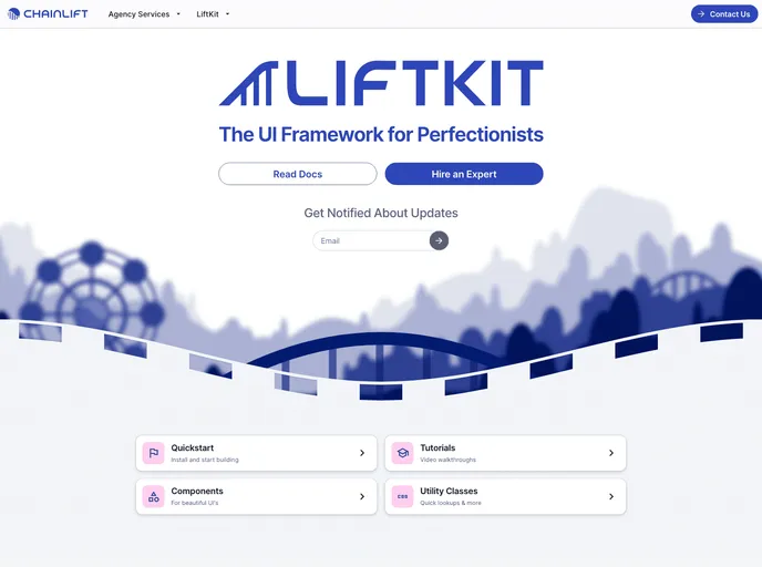
LiftKit is an innovative UI framework that leverages the golden ratio to enhance visual design. It provides developers with advanced features such as optical spacing corrections and dynamic color configurations, all powered by Material 3. This framework is designed to streamline the development process of Next.js projects while ensuring beautiful aesthetics and functionality.
Getting started with LiftKit is straightforward, whether you’re working on a brand new project or integrating it into an existing one. With its comprehensive installation guide and support for modular components, LiftKit presents itself as a robust solution for modern web development needs.
Features
-
Golden Ratio-Based Design: Utilizes principles of the golden ratio for optimal visual harmony in your UI.
-
Easy Integration: Provides cloneable templates for quick configuration, enabling speedy setup for new and existing Next.js projects.
-
Dynamic Color Capabilities: Offers advanced color management to create visually appealing applications that adapt to user preferences.
-
Modular Component System: Choose from a variety of UI components that can be added individually, minimizing bloat and enhancing performance.
-
Automatic CSS Optimization: Unused CSS is removed during build time, ensuring that your application remains lightweight and efficient.
-
Requires Minimal Dependencies: LiftKit operates smoothly without needing Tailwind CSS as a requirement, only requiring a configuration file.
-
Developer-Friendly CLI: The LiftKit CLI streamlines the initialization and installation processes, making it easy to add components and manage configurations.
-
Community Contributions Welcome: Actively seeking contributors to improve existing templates and components, fostering a collaborative development environment.
- Next.js
Next.js is a React-based web framework that enables server-side rendering, static site generation, and other powerful features for building modern web applications.
- React
React is a widely used JavaScript library for building user interfaces and single-page applications. It follows a component-based architecture and uses a virtual DOM to efficiently update and render UI components
- Shadcn UI
Beautifully designed components that you can copy and paste into your apps. Accessible. Customizable. Open Source.
- UI Kits & Components

A UI kit provides developers with a set of reusable components that can be easily integrated into a website or application. These components are pre-designed with consistent styling and functionality, allowing developers to save time and effort in the design and development process. UI kits can be either custom-built or third-party, and often include components for buttons, forms, typography, icons, and more.
- Eslint

ESLint is a linter for JavaScript that analyzes code to detect and report on potential problems and errors, as well as enforce consistent code style and best practices, helping developers to write cleaner, more maintainable code.
- MDX

MDX is a format that allows developers to write JSX within Markdown documents, combining the power of React with the simplicity of Markdown. This allows for the creation of dynamic and interactive content that can be easily shared and consumed across different platforms and devices.
- Stylelint
Stylelint is a modern linter for CSS that helps you avoid errors and enforce consistent styling conventions. It provides rules for detecting errors and warnings, and can be configured to match your specific project's requirements.
- Typescript

TypeScript is a superset of JavaScript, providing optional static typing, classes, interfaces, and other features that help developers write more maintainable and scalable code. TypeScript's static typing system can catch errors at compile-time, making it easier to build and maintain large applications.