React Responsive Masonry
React responsive masonry component built with css flexbox
Overview
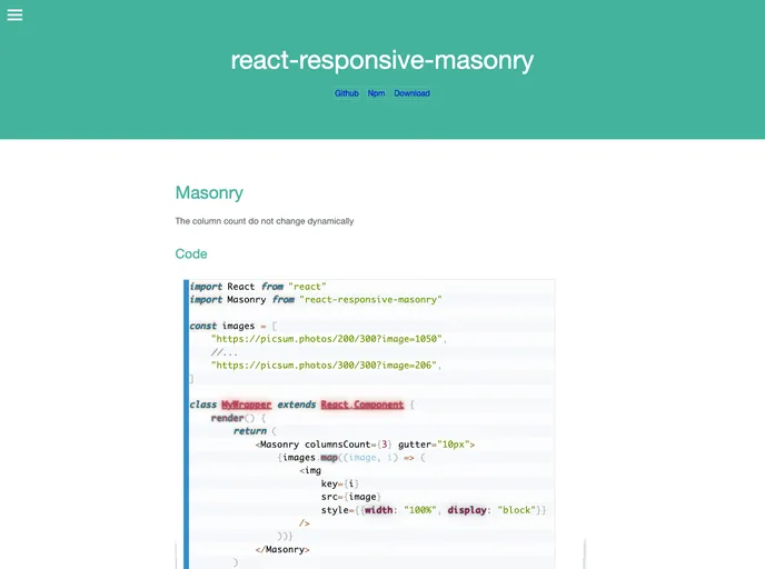
React-responsive-masonry is an innovative and lightweight component designed specifically for building responsive masonry layouts in React applications. Utilizing CSS flexbox, this package offers a seamless way to create dynamic grid structures that automatically adjust based on screen size. Whether you're building a gallery, portfolio, or any other layout requiring a flexible and beautiful use of space, this package simplifies the process while ensuring a polished end result.
Installation is straightforward, making it accessible for developers at all levels. With the ability to create layouts that elegantly resize and adapt, the react-responsive-masonry package is a delightful addition to any React project.
Features
- Responsive Layouts: Automatically adjusts the number of columns based on the screen size, ensuring your content always fits perfectly.
- Easy Installation: Available via NPM or Yarn for quick setup, or can be included directly from a CDN if preferred.
- Custom Gutter Settings: You can define the margin surrounding each item, allowing for a tailored visual experience.
- Flexible Component Props: Offers various props like className and style for custom styling of the container and items.
- Breakpoints for Columns and Gutter: Includes options to set different columns and gutter sizes for specific breakpoints, enhancing responsive design further.
- Minimalistic: Built with a focus on simplicity and performance, the component retains a small footprint in your app.
- Open for Contributions: Actively encourages community involvement for bugs or new features, promoting continuous improvement.
- React
React is a widely used JavaScript library for building user interfaces and single-page applications. It follows a component-based architecture and uses a virtual DOM to efficiently update and render UI components
- Eslint

ESLint is a linter for JavaScript that analyzes code to detect and report on potential problems and errors, as well as enforce consistent code style and best practices, helping developers to write cleaner, more maintainable code.
- GitHub Pages

Gridsome is a Vue.js-based static site generator that makes it easy to build fast and flexible websites and applications by leveraging modern web technologies like GraphQL, Webpack, and hot reloading