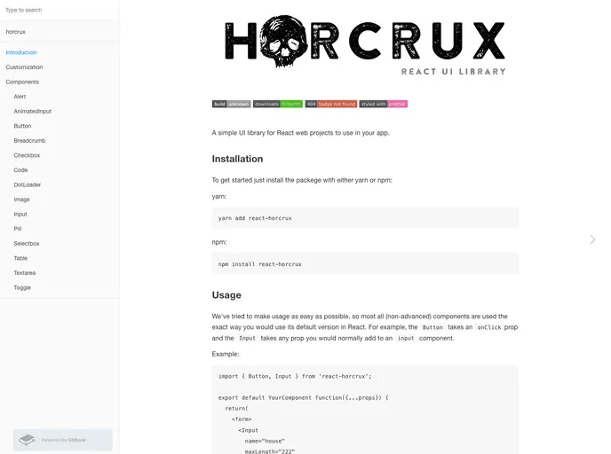
Horcrux
React web UI library
Overview
Introducing a versatile and user-friendly library designed specifically for React applications, this tool simplifies the integration of UI components while offering a delightful experience for developers. With a focus on usability, it allows for easy customization and styling, ensuring your application remains adaptable to your unique design needs. With upcoming features on the horizon, this library promises to enhance your project's capabilities and streamline your development process.
Features
-
Easy Integration: Components are designed to integrate seamlessly into your existing React app, ensuring a smooth setup and reducing the learning curve.
-
Customization Options: Utilize styled-components for extensive customization possibilities, allowing you to modify and enhance each component according to your design preferences.
-
Component Versatility: Includes essential UI elements like Buttons and Inputs that maintain familiar React properties, making it easier for developers to implement.
-
Upcoming Functionality: Exciting features like Dropdowns, Datepickers, Modals, and animated Tabviews will soon be available, expanding the library’s functionality.
-
Community Engagement: Encourages community involvement by welcoming feedback and contributions, allowing users to suggest new components or features.
-
React-Native Compatibility: Future updates will include support for React-Native, broadening the scope of projects this library can be used in.
-
Documentation and Support: Comprehensive user guides and documentation make it easy for developers to get started and utilize all available features effectively.
- React
React is a widely used JavaScript library for building user interfaces and single-page applications. It follows a component-based architecture and uses a virtual DOM to efficiently update and render UI components
- Styled Components
Styled Components is a popular library for styling React components using CSS syntax. It allows you to write CSS in your JavaScript code, making it easier to create dynamic styles that are specific to each component.
- UI Kits & Components

A UI kit provides developers with a set of reusable components that can be easily integrated into a website or application. These components are pre-designed with consistent styling and functionality, allowing developers to save time and effort in the design and development process. UI kits can be either custom-built or third-party, and often include components for buttons, forms, typography, icons, and more.
- Eslint

ESLint is a linter for JavaScript that analyzes code to detect and report on potential problems and errors, as well as enforce consistent code style and best practices, helping developers to write cleaner, more maintainable code.
- Storybook
Storybook is a tool for developing and testing UI components in isolation. It provides a sandbox environment where you can experiment with different props and states to see how your component responds.