Vite Vue3 H5
vue3.x + vite2.x + vant3.x + ts 移动端 vw + rem布局基础模板
Overview
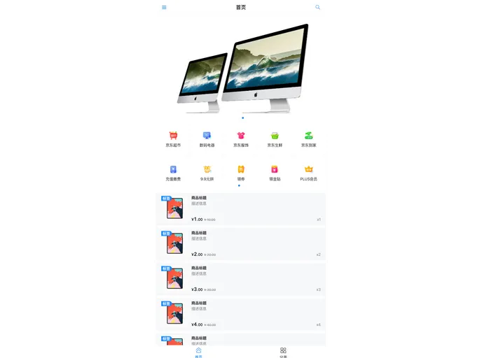
The Mobile Layout Solution is a combination of different technologies including vant3.x, vue3.x, vite2.x, ts.4.x, REM layout, and Viewport (VW) layout. It provides three layout options, including REM layout, VW layout, and a combination of REM and VW layout. The goal of these layouts is to support high-definition devices and achieve responsive design. The layouts can be implemented using the provided code snippets.
Features
- REM Layout: Utilizes dynamic font-size setting in JavaScript to adjust the size of the HTML element. CSS uses rem units and text size can be set using px. Supports 1px on high-definition devices. Provides options for setting maximum and minimum page width.
- VW Layout: Uses vw units in CSS to achieve responsive design. Text size can be set using px. Supports 1px borders, including rounded corners, on high-definition devices. Provides options for setting fixed aspect ratios for containers.
- REM + VW Layout: Combines the use of vw units for HTML font-size with rem units for CSS. Text size can be set using px. Supports 1px borders, including rounded corners, on high-definition devices. Provides options for setting fixed aspect ratios for containers. Supports setting maximum and minimum page width.
Summary
The Mobile Layout Solution provides three different layout options for mobile devices: REM layout, VW layout, and a combination of REM and VW layout. These layouts aim to achieve responsive design and support high-definition devices. The solution includes code snippets and examples to guide the installation and implementation process.
- Vite
Vite is a build tool that aims to provide a faster and leaner development experience for modern web projects
- Vue
Vue.js is a lightweight and flexible JavaScript framework that allows developers to easily build dynamic and reactive user interfaces. Its intuitive syntax, modular architecture, and focus on performance make it a popular choice for modern web development.
- SCSS
SCSS is a preprocessor scripting language that extends the capabilities of CSS by adding features such as variables, nesting, and mixins. It allows developers to write more efficient and maintainable CSS code, and helps to streamline the development process by reducing repetition and increasing reusability.
- Eslint

ESLint is a linter for JavaScript that analyzes code to detect and report on potential problems and errors, as well as enforce consistent code style and best practices, helping developers to write cleaner, more maintainable code.
- Pinia

Pinia is the official state management library for Vue.js. It provides a simple and intuitive API with full TypeScript support, devtools integration, and modular design. Pinia replaces Vuex as the recommended state management solution for Vue 3.
- Postcss

PostCSS is a popular open-source tool that enables web developers to transform CSS styles with JavaScript plugins. It allows for efficient processing of CSS styles, from applying vendor prefixes to improving browser compatibility, ultimately resulting in cleaner, faster, and more maintainable code.
- Stylelint
Stylelint is a modern linter for CSS that helps you avoid errors and enforce consistent styling conventions. It provides rules for detecting errors and warnings, and can be configured to match your specific project's requirements.
- Typescript

TypeScript is a superset of JavaScript, providing optional static typing, classes, interfaces, and other features that help developers write more maintainable and scalable code. TypeScript's static typing system can catch errors at compile-time, making it easier to build and maintain large applications.