Box UI Elements
React Components for Box's Design System and Pluggable Components
Overview
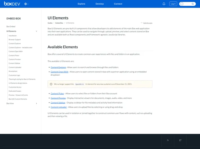
Box UI Elements offer a suite of pre-built UI components specifically designed for developers looking to integrate the core features of the Box web application into their own projects seamlessly. These elements provide a powerful way to navigate, upload, preview, and select content that resides within Box, enhancing user interaction and preserving the overall user experience. Built as React components and framework-agnostic JavaScript libraries, Box UI Elements enable easier and efficient content management in applications.
Whether you are a seasoned React developer or someone looking to add functional UI components into your app without delving too deep into custom development, Box UI Elements could be a game-changer for you. The convenience of installation and the ready-to-use nature of these components allow for quick deployment and integration into existing workflows.
Features
- Pre-Built Components: Get instant access to essential UI components like ContentExplorer, ContentUploader, and ContentPreview that are designed for smooth interaction with Box content.
- Framework-Agnostic Libraries: These UI Elements can be easily utilized within any JavaScript framework, providing flexibility in development.
- SCSS Stylesheets: Each UI Element comes with built-in SCSS styles, ensuring consistent styling while requiring minimal setup during integration.
- Code Splitting Support: Improve performance through code splitting capabilities that help to optimize loading times and resource usage within your application.
- Comprehensive Browser Support: Box UI Elements support major browsers, including the latest versions of Chrome, Firefox, Safari, and Edge for desktops, as well as mobile Chrome and Safari.
- Ease of Installation: Quickly integrated into your project with a simple command using yarn or npm, saving valuable time in setup.
- Extensive Documentation: Well-documented resources and demos are available to guide developers through the implementation process, ensuring a smooth development experience.
- Customization Ready: Tailor components to fit your application's unique design requirements while still leveraging the functionality provided by Box.
- React
React is a widely used JavaScript library for building user interfaces and single-page applications. It follows a component-based architecture and uses a virtual DOM to efficiently update and render UI components
- SCSS
SCSS is a preprocessor scripting language that extends the capabilities of CSS by adding features such as variables, nesting, and mixins. It allows developers to write more efficient and maintainable CSS code, and helps to streamline the development process by reducing repetition and increasing reusability.
- Styled Components
Styled Components is a popular library for styling React components using CSS syntax. It allows you to write CSS in your JavaScript code, making it easier to create dynamic styles that are specific to each component.
- React Aria
Craft world-class accessible components with custom styles. Over 40 components with built-in behavior, adaptive interactions, top-tier accessibility, and internationalization out of the box, ready for your styles.
- Eslint

ESLint is a linter for JavaScript that analyzes code to detect and report on potential problems and errors, as well as enforce consistent code style and best practices, helping developers to write cleaner, more maintainable code.
- Postcss

PostCSS is a popular open-source tool that enables web developers to transform CSS styles with JavaScript plugins. It allows for efficient processing of CSS styles, from applying vendor prefixes to improving browser compatibility, ultimately resulting in cleaner, faster, and more maintainable code.
- Storybook
Storybook is a tool for developing and testing UI components in isolation. It provides a sandbox environment where you can experiment with different props and states to see how your component responds.
- Stylelint
Stylelint is a modern linter for CSS that helps you avoid errors and enforce consistent styling conventions. It provides rules for detecting errors and warnings, and can be configured to match your specific project's requirements.
- Typescript

TypeScript is a superset of JavaScript, providing optional static typing, classes, interfaces, and other features that help developers write more maintainable and scalable code. TypeScript's static typing system can catch errors at compile-time, making it easier to build and maintain large applications.
- Webpack

Webpack is a popular open-source module bundler for JavaScript applications that bundles and optimizes the code and its dependencies for production-ready deployment. It can also be used to transform other types of assets such as CSS, images, and fonts.
- Formik

Formik is a popular form library for React that helps with form state management, validation, and submission handling. It provides a declarative approach to building forms with support for complex validation scenarios and easy integration with validation libraries like Yup.