UI Library
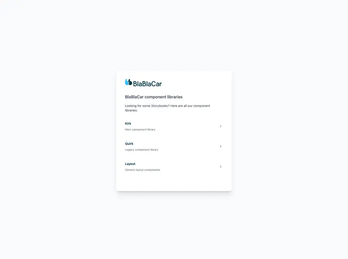
BlaBlaCar React Component Library
Overview
The BlaBlaCar React component library offers a collection of UI components designed to streamline the development process for React applications. While it has transitioned to a closed-source model, the availability of its Storybook allows developers to visualize and interact with the components seamlessly. This library is particularly appealing to those looking for a structured and efficient way to implement UI elements in their projects.
Features
- Comprehensive Component Library: Includes a wide range of pre-built components that cater to various design needs, ensuring consistency across your application.
- Storybook Integration: The library's Storybook allows developers to view and test components in isolation, facilitating easier customization and implementation.
- Responsive Design: All components are optimized for responsiveness, making it easier to build applications that look great on any device.
- Customizable Themes: The ability to easily modify themes and styles ensures that your application can maintain a unique look that aligns with your brand.
- Documentation: While the core library is closed-source, the accompanying documentation provides valuable insights on how to effectively use the components.
- Active Community: As part of the BlaBlaCar ecosystem, developers can benefit from a supportive community that shares best practices and solutions.
- Performance Optimized: Components are designed with performance in mind, ensuring a smooth user experience even under heavy load.