React Themes
UI theme composition with CSS Modules and React
Overview
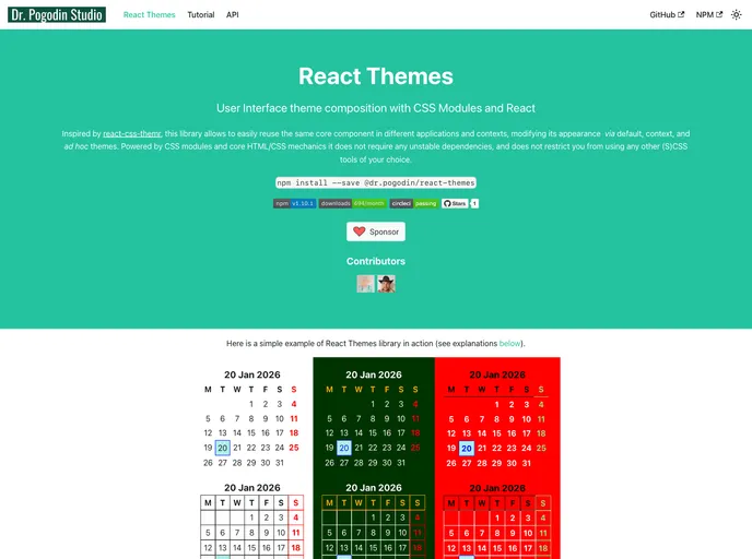
React Themes is a library that provides themeable UI styling for React components. It allows developers to easily reuse core components across different applications and contexts, and modify their appearance using default, context, and ad hoc themes. Powered by CSS modules and core HTML/CSS mechanics, React Themes does not rely on unstable dependencies and does not restrict developers from using other (S)CSS tools of their choice.
Features
- Themeable UI styling for React components.
- Theme composition features based on react-css-themr ideas.
- Easy reuse of core components in different applications and contexts.
- Modification of component appearance using default, context, and ad hoc themes.
- Powered by CSS modules and core HTML/CSS mechanics.
- No unstable dependencies.
- Flexibility to use other (S)CSS tools of choice.
Summary
React Themes is a library that provides themeable UI styling for React components. It allows for easy reuse of core components across different applications and contexts, with the ability to modify their appearance through themes. The library is powered by CSS modules and core HTML/CSS mechanics, ensuring stability without relying on unstable dependencies. Developers using React Themes also have the flexibility to use other (S)CSS tools of their choice.