Svelte Image Gallery
A Masonry-Like Image Container for Svelte
Overview
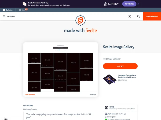
svelte-image-gallery is a Masonry-Like Image Container designed specifically for the Svelte framework. It provides a responsive image gallery out of the box and allows customization through various parameters.
Features
- Responsive out of the box: The image gallery is automatically responsive, adapting to different screen sizes and resolutions.
- Customizable grid gap: Users can specify the grid gap between items in the gallery using the
gapparameter. - Maximum column width: The
maxColumnWidthparameter can be used to set the maximum width for each column in the gallery. - Enlarge image on hover: By setting the
hoverparameter totrue, users can enable image enlargement when hovering over them. - Flexible image loading: Users can control the image loading behavior using the
loadingparameter, which supports different loading types.
Summary
svelte-image-gallery is a versatile component for creating Masonry-Like image containers in Svelte. It offers responsiveness out of the box, customizable parameters, and easy installation. With this component, users can quickly create dynamic and visually appealing image galleries for their Svelte applications.
- Svelte
Svelte is a modern front-end framework that compiles your code at build time, resulting in smaller and faster applications. It uses a reactive approach to update the DOM, allowing for high performance and a smoother user experience.