Fletura
A material UI built with flet library
Overview
Fletura is a dynamic library designed to enhance the development of applications built with the Flet framework. It provides a variety of reusable and customizable components that can significantly speed up the design process, allowing developers to focus more on functionality than UI intricacies. With an emphasis on flexibility, Fletura is well-suited for both novice and experienced developers looking to streamline their project workflows.
This library encompasses a wide range of components, including cards, docks, ratings, and more. Each component is thoughtfully crafted to facilitate a high level of customization, ensuring that developers can tailor their applications to meet specific design requirements while ensuring a seamless user experience. Whether you're aiming to create engaging user interfaces or deliver critical information through notifications, Fletura has the tools you need.
Features
-
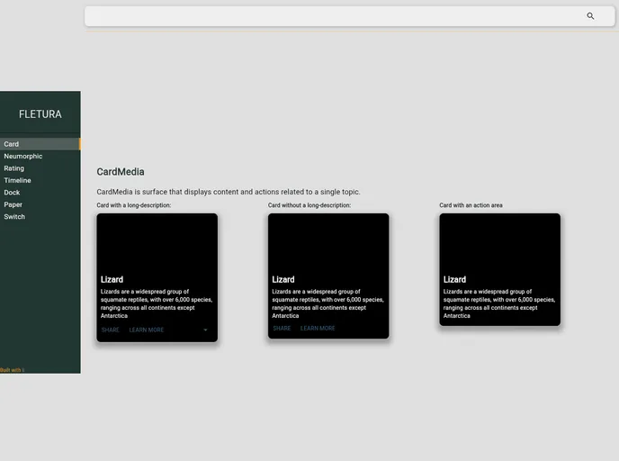
CardMedia Component: Displays content and actions related to a single topic with customizable properties such as image source, title, and description, making it easy to convey important information visually.
-
Dock Component: Provides a visually appealing UI for notifications or status indicators, allowing developers to create interactive icons with counters for messages or alerts positioned wherever needed on the screen.
-
Rating System: Offers a robust rating component that enables users to provide feedback, with flexible options for controlled, read-only, or disabled states, along with a variety of icon styles and sizes.
-
Switch Component: A customizable toggle switch that allows users to make binary choices intuitively, with adjustable styles to match the application’s theme.
-
Timeline Component: Helps create a visual sequence of events or milestones, making it easier to present chronological information in an engaging format.
-
Neumorphic Elements: Incorporates modern design trends, offering neumorphic styles for components that add depth while maintaining usability and aesthetics.
-
Container Options: Includes various container types like Convex, Floating, and Flat Containers that provide diverse layouts, enhancing the versatility of your application layout.
-
Easy Installation and Setup: The library is easy to install via pip, ensuring that developers can quickly incorporate Fletura into their projects without unnecessary hassle.
- UI Kits & Components

A UI kit provides developers with a set of reusable components that can be easily integrated into a website or application. These components are pre-designed with consistent styling and functionality, allowing developers to save time and effort in the design and development process. UI kits can be either custom-built or third-party, and often include components for buttons, forms, typography, icons, and more.