Shared
Boilerplate for creating React component libraries, with Rollup.js ,Storybook, Typescript, Tailwind CSS, Shadcn/ui
Overview:
SharedShared is a boilerplate for writing React Libraries bundled with Rollup.js. It includes support for commonJS, ES6 modules, Storybook, Tailwind CSS, and Shadcn/ui. With this project, developers can quickly start developing their own React libraries and easily publish them to NPM or their private registry.
Features:
- Development environment set up with Rollup.js for building React libraries
- Support for commonJS and ES6 modules
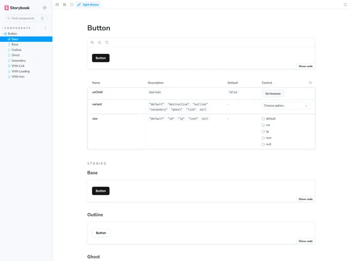
- Integration with Storybook to showcase component libraries
- Integration with Tailwind CSS for styling components
- Support for Shadcn/ui for additional design components
- Linting and code formatting with ESLint and Prettier integration
- Testing with Vitest and @testing-library/react
Summary:
SharedShared is a boilerplate for developing React libraries bundled with Rollup.js. It provides an out-of-the-box development environment with support for commonJS, ES6 modules, Storybook, Tailwind CSS, and Shadcn/ui. With features like linting, testing, and easy publishing to NPM or private registries, SharedShared simplifies the process of creating and showcasing React component libraries.
- React
React is a widely used JavaScript library for building user interfaces and single-page applications. It follows a component-based architecture and uses a virtual DOM to efficiently update and render UI components
- Shadcn UI
Beautifully designed components that you can copy and paste into your apps. Accessible. Customizable. Open Source.
- UI Kits & Components

A UI kit provides developers with a set of reusable components that can be easily integrated into a website or application. These components are pre-designed with consistent styling and functionality, allowing developers to save time and effort in the design and development process. UI kits can be either custom-built or third-party, and often include components for buttons, forms, typography, icons, and more.
- Storybook
Storybook is a tool for developing and testing UI components in isolation. It provides a sandbox environment where you can experiment with different props and states to see how your component responds.