Responsive Website Delivery
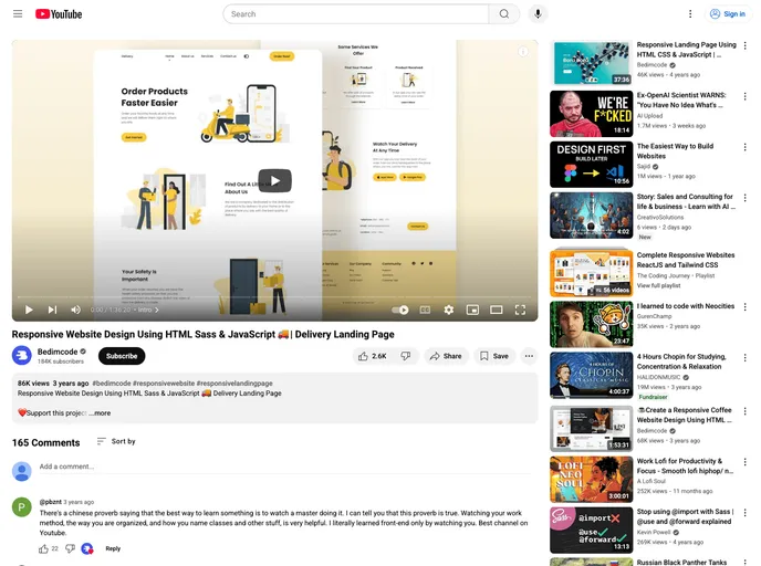
Responsive Delivery Website Design Using HTML Sass & JavaScript
Overview
Responsive Website Delivery is an innovative solution aimed at creating seamless web experiences across devices. By leveraging HTML, Sass, and JavaScript, it offers a robust infrastructure to ensure that websites are visually appealing and functional, regardless of the platform. The development approach emphasizes mobile-first design, catering to the needs of users who access sites predominantly through mobile devices. This adaptability, paired with aesthetic features, makes it a compelling choice for anyone looking to enhance their online presence.
Features
- Dark and Light Mode: Offers users the flexibility to switch between themes for comfortable viewing in different environments.
- Color Customization: Easily adjust color schemes to match brand identity or personal preferences, enhancing visual appeal.
- Mobile First Methodology: Prioritizes mobile user experience, ensuring that sites look and function great on smartphones and tablets before scaling up to desktop.
- Compatibility: Works seamlessly across all mobile devices, guaranteeing a consistent experience for users regardless of their device.
- Beautiful User Interface: Designed with aesthetics in mind, providing a pleasant and engaging experience for visitors.
- Intuitive Navigation: Simplifies user interaction with easy-to-use menus and layout, making site navigation effortless.