Responsive Real State Website
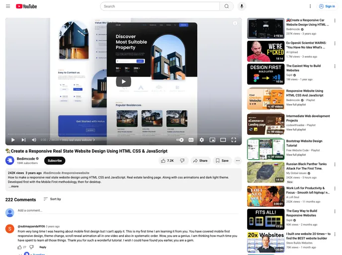
Responsive Real State Website Design Using HTML CSS & JavaScript
Overview
The Responsive Real State Website is an innovative solution designed to showcase properties effectively and attractively. Built using HTML, CSS, and JavaScript, this website offers a modern, user-friendly interface that caters to both mobile and desktop users. Its design philosophy focuses on providing aesthetic appeal without sacrificing functionality, making it an ideal choice for real estate businesses looking to enhance their online presence.
The website stands out with its smooth navigation and adaptability across various devices, ensuring users have a seamless experience whether they're browsing on a smartphone or a desktop computer. Its light and dark modes enhance visual comfort, making it suitable for any time of day.
Features
- Animation Effects: The website includes engaging animations that activate upon scrolling, creating a dynamic browsing experience.
- Light and Dark Mode: Users can switch between light and dark themes based on their preferences, improving usability and comfort.
- Smooth Scrolling: Each section transitions smoothly as users navigate, making the experience enjoyable and intuitive.
- Mobile First Design: Developed initially for mobile devices, ensuring optimal performance and aesthetics on smaller screens before scaling to desktop.
- Compatibility: Fully responsive design guarantees compatibility with all mobile devices, enhancing accessibility for users on the go.
- User-Friendly Interface: The clean and appealing design contributes to an overall pleasant experience, making property browsing effortless.