Responsive Portfolio Website Ansel
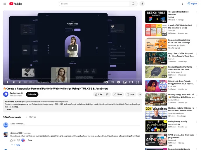
Create a Responsive Personal Portfolio Website Using HTML CSS & JavaScript
Overview
The Responsive Portfolio Website built with HTML, CSS, and JavaScript showcases a clean and modern design tailored for seamless user experience. This website is an excellent choice for freelancers, creatives, or anyone looking to display their work in an engaging manner. With its focus on smooth navigation and adaptable aesthetics, it ensures that both mobile and desktop users can enjoy the portfolio without any hitches.
Features
-
Responsive Design: The website is designed to adapt to various screen sizes, ensuring an optimal viewing experience on any device.
-
Smooth Scrolling: Enjoy fluid transitions between sections, enhancing overall navigation and user engagement.
-
Dark and Light Mode: Users can easily switch between dark and light themes, catering to personal preferences and improving visibility.
-
Mobile First Approach: Developed with a mobile-first mindset, the website excels in performance on smartphones and tablets before adapting to desktop screens.
-
Compatible with All Mobile Devices: The design is universally compatible, making it accessible for users across a wide range of devices.
-
User-Friendly Interface: The layout is visually appealing and intuitively organized, allowing visitors to navigate effortlessly.
- Personal

A personal website is an online platform that showcases an individual's work, interests, and personality. It can include a range of content, such as a bio, resume, portfolio, blog, and contact information, and is often used to promote one's personal brand or professional services.