Responsive Gym Website
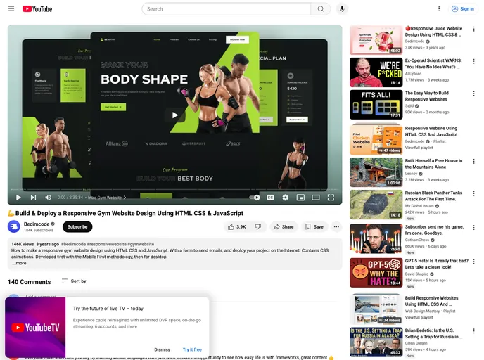
Responsive Gym Website Design Using HTML CSS & JavaScript
Overview
The Responsive Gym Website Design is a modern approach to creating an engaging online platform for fitness enthusiasts. Built using HTML, CSS, and JavaScript, this design caters to a wide audience by ensuring seamless functionality across various devices. The focus on a mobile-first methodology guarantees that users experience a beautiful interface, irrespective of the screen size they are using.
Whether you're running a gym or simply want to showcase your fitness services online, this design incorporates essential features that not only enhance usability but also aesthetics. Its ability to create a pleasant user experience makes it a noteworthy option for anyone looking to establish or upgrade their fitness website.
Features
- Responsive Design: Adapts to any screen size, ensuring optimal viewing on all devices, particularly mobile.
- Scrolling Animations: Engaging animated elements that enhance the visual experience as users scroll through the site.
- BMI Calculator: A built-in form allowing users to easily calculate their body mass index, promoting health awareness.
- Email Submission Form: Facilitates easy communication by allowing visitors to send emails directly through the website.
- Mobile First Approach: Initially developed for mobile devices, ensuring a straightforward experience for users on handheld gadgets before scaling up for desktop.
- User-Friendly Interface: Designed with a focus on aesthetics and ease of navigation, making it appealing to users while also functional.