Responsive Car Website
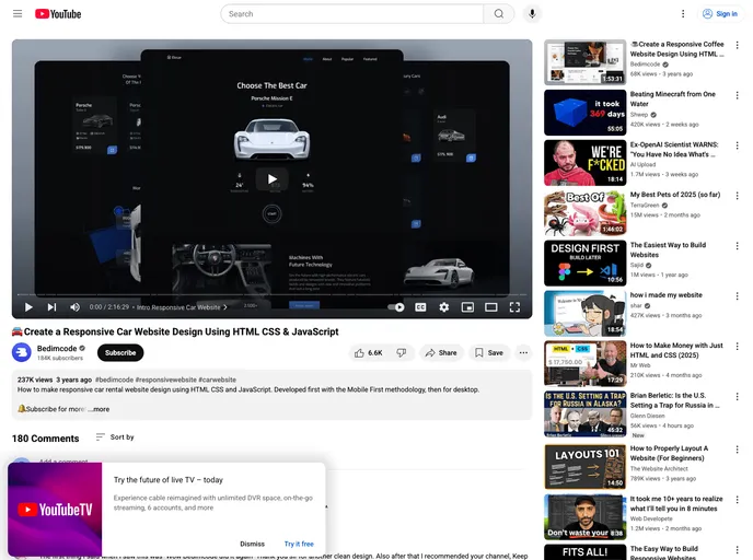
Responsive Car Website Design Using HTML CSS & JavaScript
Overview
The Responsive Car website is an impressive showcase of modern web design, utilizing HTML, CSS, and JavaScript to create a smooth and engaging user experience. With a focus on mobile-first design, this website seamlessly adapts to various devices, ensuring that users can easily navigate and enjoy the content whether they're on their phone, tablet, or desktop.
This website stands out not only for its responsive capabilities but also for its eye-catching animations and user-friendly interface. It's a remarkable example of how modern web technologies can work together to offer a pleasing aesthetic and functionality.
Features
- Mobile-First Design: Initially developed with mobile usability in mind, ensuring a great experience on smaller screens before scaling up for desktops.
- Smooth Scrolling: Each section of the website features smooth scrolling, making navigation effortless and fluid for users.
- Cross-Device Compatibility: The design and layout are fully compatible with all mobile devices, providing a consistent experience across platforms.
- Engaging Animations: Includes visually appealing animations that activate during scrolling, adding dynamism to the browsing experience.
- User-Friendly Interface: The website boasts a beautiful and pleasant user interface that enhances the overall user experience.
- Responsive Layout: Adapts to varying screen sizes, ensuring content is always displayed optimally, regardless of the device used.
- JavaScript Integration: Utilizes JavaScript for interactive features that enhance the website's functionality.