Responsive Bottom Navigation
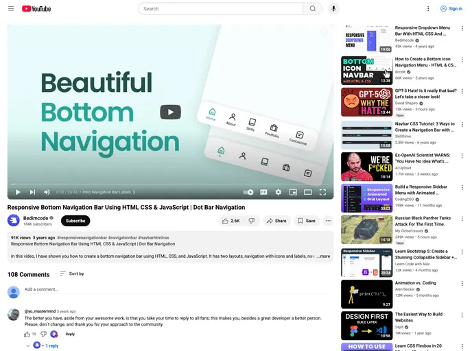
Responsive Bottom Navigation Bar Using HTML CSS & JavaScript
Overview:
The Responsive Bottom Navigation Bar is an innovative solution for website navigation that enhances user experience on mobile devices. This design focuses on a seamless browsing experience, ensuring that users can easily access different sections of a site without clutter. With options to choose from label or point designs, this navigation bar aims to provide versatility and functionality to various web projects.
Features:
- Mobile First Design: Developed primarily for mobile functionality, ensuring optimal performance on smaller screens before adapting to desktop use.
- Two Navigation Styles: Offers a choice between designs with labels or points, allowing customization to fit the website's aesthetic.
- Smooth Scrolling: Incorporates smooth scrolling effects for a fluid transition between sections, enhancing the overall user experience.
- Compatible with All Devices: Designed to work seamlessly across all mobile devices, ensuring users can navigate effortlessly regardless of the platform.
- User-Friendly Interface: Features an attractive and pleasant user interface that aligns with modern web design standards.
- Easy Integration: Can be easily implemented using HTML, CSS, and JavaScript, making it accessible for developers at all skill levels.