Designsystem
Overview
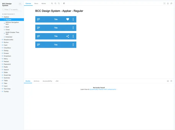
BCC - Design System is a comprehensive design system available at npmjs. It provides a set of components and guidelines for creating visually appealing and consistent user interfaces. The design system aims to enhance the efficiency and productivity of development teams by offering ready-to-use UI components.
Features
- Comprehensive: BCC - Design System offers a wide range of components, enabling developers to build robust and feature-rich interfaces.
- Consistent: The design system ensures visual consistency throughout the application, enhancing the user experience.
- Easy installation: BCC - Design System can be easily installed via npm, making it convenient to integrate into any project.
- Well-documented: The design system provides thorough documentation, allowing developers to quickly understand and utilize its features.
- Contributing guidelines: Developers interested in contributing to the project can refer to the contributing guidelines, ensuring a smooth development process.
- Code of conduct: The project has a code of conduct in place, maintaining a respectful and inclusive environment for all contributors.
Summary
BCC - Design System is a versatile design system that provides developers with a comprehensive collection of components and guidelines. Its features, including visual consistency, extensive documentation, and ease of installation, make it a valuable tool for building user interfaces. With clear contributing guidelines and a code of conduct, the design system promotes collaboration and inclusivity within the development community.
- React
React is a widely used JavaScript library for building user interfaces and single-page applications. It follows a component-based architecture and uses a virtual DOM to efficiently update and render UI components
- Styled Components
Styled Components is a popular library for styling React components using CSS syntax. It allows you to write CSS in your JavaScript code, making it easier to create dynamic styles that are specific to each component.
- UI Kits & Components

A UI kit provides developers with a set of reusable components that can be easily integrated into a website or application. These components are pre-designed with consistent styling and functionality, allowing developers to save time and effort in the design and development process. UI kits can be either custom-built or third-party, and often include components for buttons, forms, typography, icons, and more.