Components
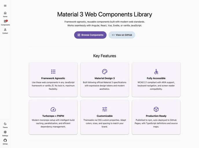
Material 3 Expressive - Web Components - Material Web Implementation
Overview
Components is an innovative web implementation that embodies Material 3's expressive design principles. This toolkit allows developers to seamlessly integrate modern design elements into their web applications, enhancing both aesthetics and user experience. With a focus on flexibility and modularity, Components offers a wide array of customizable options that cater to various project needs.
Features
- Material 3 Integration: Easily adopt Material 3 design features, ensuring that applications maintain a contemporary and appealing look.
- Web Components Compatibility: Leverage the power of Web Components, allowing for reusable and encapsulated custom elements that fit any project structure.
- Customizable Designs: Tailor components to align with your branding and design preferences, providing a unique touch to your web applications.
- Responsive Layouts: Build interfaces that gracefully adapt to different screen sizes and devices, ensuring an optimal user experience across platforms.
- Accessible Features: Adhere to accessibility standards, making it easier for all users to engage and navigate your applications.
- Lightweight Performance: Enjoy quick load times and smooth interactions due to the lightweight nature of the components, ideal for performance-focused applications.
- Rich Documentation: Benefit from comprehensive documentation that guides you through setup, usage, and best practices, facilitating a smooth development process.
- Material UI
material-ui adds classes to Tailwind CSS for all common UI components. Classes like btn, card, etc. This allows us to focus on important things instead of making basic elements for every project.