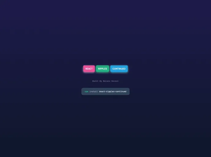
React Ripples Continued
The material design ripple effect for react made simple yet customisable. `npm i react-ripples-continued`
Overview
React Ripples Continued is a component that provides a visual ripple effect, commonly used for button click or touch feedback. Inspired by material design principles, this component adds a sleek and interactive element to your React application.
Features
- onType: Determines the event that triggers the ripple effect. Default value is "click".
- colorType: Sets the color of the ripple effect. Default value is "white".
- opacityType: Sets the opacity of the ripple effect. Accepts values between 0 (completely transparent) and 1 (completely opaque). Default value is 1.
- blurType: Sets the blur amount for the ripple effect. Default value is 0.
- durationType: Determines the duration of the ripple animation in milliseconds. Default value is 500.
- fillAndHoldType: When set to true, the ripple effect will fill the container and hold its position until a mouse up event occurs. Default value is false.
- optimizeType: When set to true, the ripple elements will be removed from the DOM after the animation completes. Default value is false.
- rippleElementType: When handed JSX, it will display that JSX inside the ripple. Default value is undefined.
Summary
React Ripples Continued is a powerful component that adds a visually appealing ripple effect to your React application. With customizable props and easy installation, this component is a great choice for implementing material design principles in your UI.
- Next.js
Next.js is a React-based web framework that enables server-side rendering, static site generation, and other powerful features for building modern web applications.
- React
React is a widely used JavaScript library for building user interfaces and single-page applications. It follows a component-based architecture and uses a virtual DOM to efficiently update and render UI components
- Tailwind
Tailwind CSS is a utility-first CSS framework that provides pre-defined classes for building responsive and customizable user interfaces.
- Material UI
material-ui adds classes to Tailwind CSS for all common UI components. Classes like btn, card, etc. This allows us to focus on important things instead of making basic elements for every project.
- Documentation

Documentation themes are built specifically for writing technical and product documentation. They are normally written and maintained in Markdown. The often include a navigation menu, search bar, clear headings, semantic document structure and clean typography.
- Eslint

ESLint is a linter for JavaScript that analyzes code to detect and report on potential problems and errors, as well as enforce consistent code style and best practices, helping developers to write cleaner, more maintainable code.
- Postcss

PostCSS is a popular open-source tool that enables web developers to transform CSS styles with JavaScript plugins. It allows for efficient processing of CSS styles, from applying vendor prefixes to improving browser compatibility, ultimately resulting in cleaner, faster, and more maintainable code.
- Typescript

TypeScript is a superset of JavaScript, providing optional static typing, classes, interfaces, and other features that help developers write more maintainable and scalable code. TypeScript's static typing system can catch errors at compile-time, making it easier to build and maintain large applications.