Generator React Exhibit
A react component library boilerplate, built with create-react-app and storybook
Overview:
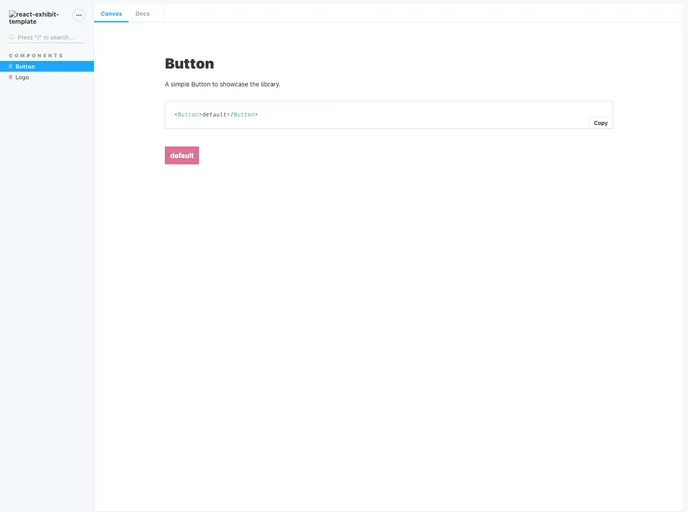
This product is a generator that allows users to create their own React component library with documentation. It is built on top of create-react-app and uses the react-exhibit-template as a template. It provides a live view of the component library and allows users to include components in the storybook by adding a <componentName>.stories.js file in the component folder. It also offers a set of scripts for testing, building, and analyzing the project, as well as options for deploying the documentation and publishing the library to npm.
Features:
- React component library generator
- Integration with create-react-app and react-exhibit-template
- Live view of the component library
- Easy inclusion of components in the storybook
- Set of scripts for testing, building, and analyzing the project
- Deployment options for the documentation
- Publishing the library to npm
- Dependency map generation
Summary:
This product is a powerful tool for creating and documenting React component libraries. It offers a seamless integration with create-react-app and provides an easy way to include components in the storybook. The set of scripts provided allows for testing, building, and analyzing the project, and there are options for deploying the documentation and publishing the library to npm. Overall, this generator is a convenient and efficient solution for developing and sharing React component libraries.
- Create React App
Create React App is a popular tool for quickly setting up a new React project without the need for manual configuration or setup. It provides a preconfigured development environment with modern build tools, a live development server, and an easy-to-use command line interface.
- React
React is a widely used JavaScript library for building user interfaces and single-page applications. It follows a component-based architecture and uses a virtual DOM to efficiently update and render UI components
- Styled Components
Styled Components is a popular library for styling React components using CSS syntax. It allows you to write CSS in your JavaScript code, making it easier to create dynamic styles that are specific to each component.
- UI Kits & Components

A UI kit provides developers with a set of reusable components that can be easily integrated into a website or application. These components are pre-designed with consistent styling and functionality, allowing developers to save time and effort in the design and development process. UI kits can be either custom-built or third-party, and often include components for buttons, forms, typography, icons, and more.
- Eslint

ESLint is a linter for JavaScript that analyzes code to detect and report on potential problems and errors, as well as enforce consistent code style and best practices, helping developers to write cleaner, more maintainable code.
- Storybook
Storybook is a tool for developing and testing UI components in isolation. It provides a sandbox environment where you can experiment with different props and states to see how your component responds.