Snake Eater UI
Snake Eater UI - a modern milsim component library
Overview
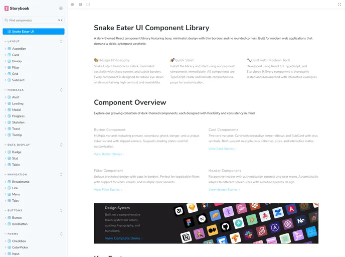
Snake Eater UIA is an innovative dark-themed React component library that caters to modern developers looking for a sleek and minimalist aesthetic. With its roots in TypeScript and the Storybook documentation framework, it captures a distinctive cyberpunk vibe through sharp corners and thin borders. Built upon the design principles of Steve Lauda, this library emphasizes usability while maintaining an edgy appearance that stands out in the world of UI components.
This library comes packed with over 45 meticulously crafted components, making it a comprehensive toolkit for building applications that excel in both functionality and style. Its zero runtime dependencies ensure that you're not weighing down your projects, while the full support for TypeScript provides peace of mind with type definitions.
Features
- 🌑 Dark Theme: Optimized for applications that embrace dark mode, ensuring eye comfort and modern aesthetics.
- 📦 45+ Components: A vast collection of UI components sorted by categories, enabling quick access and implementation.
- 🎨 Edgy Design: Featuring sharp corners and thin borders, this library offers a unique and contemporary look for digital interfaces.
- 🚀 Zero Runtime Dependencies: Lightweight and efficient, it promotes high performance without unnecessary bloat.
- 📝 TypeScript Support: Full type definitions included, empowering developers with robust type safety.
- 📚 Storybook Documentation: An interactive playground allows for easy examination and testing of components in real-time.
- 🎯 Organized Structure: Components are logically categorized, streamlining the development process and enhancing productivity.
- React
React is a widely used JavaScript library for building user interfaces and single-page applications. It follows a component-based architecture and uses a virtual DOM to efficiently update and render UI components
- UI Kits & Components

A UI kit provides developers with a set of reusable components that can be easily integrated into a website or application. These components are pre-designed with consistent styling and functionality, allowing developers to save time and effort in the design and development process. UI kits can be either custom-built or third-party, and often include components for buttons, forms, typography, icons, and more.
- Eslint

ESLint is a linter for JavaScript that analyzes code to detect and report on potential problems and errors, as well as enforce consistent code style and best practices, helping developers to write cleaner, more maintainable code.
- Rollup

RollupJS is a popular and efficient JavaScript module bundler that takes the code from multiple modules and packages them into a single optimized file, minimizing the overall size of the application and improving its performance.
- Storybook
Storybook is a tool for developing and testing UI components in isolation. It provides a sandbox environment where you can experiment with different props and states to see how your component responds.
- Typescript

TypeScript is a superset of JavaScript, providing optional static typing, classes, interfaces, and other features that help developers write more maintainable and scalable code. TypeScript's static typing system can catch errors at compile-time, making it easier to build and maintain large applications.