Asyncapi React
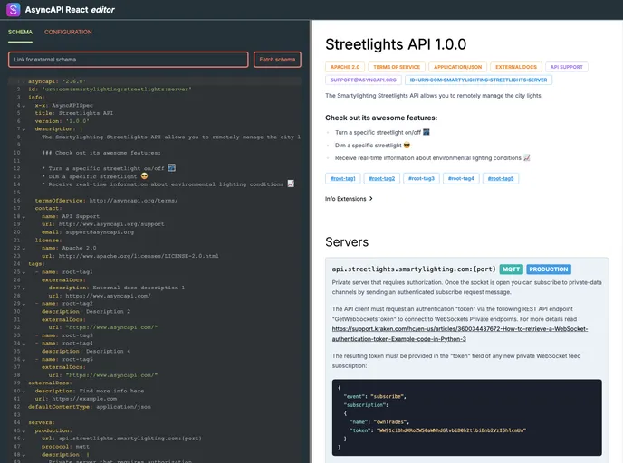
React component for rendering documentation from your specification in real-time in the browser. It also provides a WebComponent and bundle for Angular and Vue
Overview
The AsyncAPI React Component is an excellent tool for developers looking to integrate and render AsyncAPI specifications within their React applications. This component not only provides robust documentation capabilities for asynchronous APIs but also offers great flexibility in customization. Whether you are working on a new project or looking to enhance an existing one, the AsyncAPI React Component makes it simple to visualize your API's structure and functionality.
By leveraging this component, users can ensure their AsyncAPI specifications are not only accurate but also presented in an aesthetically pleasing manner, tailored to suit the specific design needs of their applications. The ease of installation and the variety of options for customization make it an appealing choice for both seasoned developers and newcomers alike.
Features
- Seamless Integration: This component is built specifically for React, ensuring smooth integration into any React-based application, while also available as a web component for broader compatibility.
- Customizable Appearance: Developers can restyle the component using their custom styles, allowing for full control over the look and feel to match the overall theme of their project.
- Support for Custom Logos: Enhance your documentation with the ability to include a custom logo, adding brand identity to your API presentation.
- Flexible Schema Handling: It supports multiple ways to input your AsyncAPI specifications, including strings, parsed JavaScript objects, and external fetching options, making it versatile for various use cases.
- Configuration Options: The component allows for extensive configuration through optional props, enabling developers to modify behaviors without altering the core structure.
- Default and Custom Styles: Use predefined styles for quick set-up or create tailored styles via external CSS files or inline styles, making it easy to achieve the desired aesthetic.
- Stand-Alone and Multi-Framework Compatibility: Beyond React, the component can be utilized in Angular, Vue, and NextJS, providing options for developers working across different frameworks.
- React
React is a widely used JavaScript library for building user interfaces and single-page applications. It follows a component-based architecture and uses a virtual DOM to efficiently update and render UI components
- Eslint

ESLint is a linter for JavaScript that analyzes code to detect and report on potential problems and errors, as well as enforce consistent code style and best practices, helping developers to write cleaner, more maintainable code.
- Typescript

TypeScript is a superset of JavaScript, providing optional static typing, classes, interfaces, and other features that help developers write more maintainable and scalable code. TypeScript's static typing system can catch errors at compile-time, making it easier to build and maintain large applications.