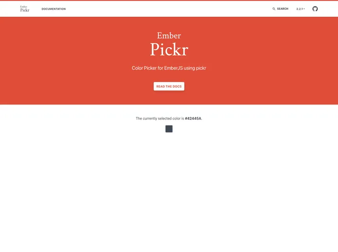
Ember Pickr
Color Picker for EmberJS using pickr
Overview
The ember-pickr is a versatile color picker designed specifically for EmberJS applications, utilizing the popular Pickr library. It provides a robust and flexible way to incorporate color selections into interfaces, with a plethora of options tailored to enhance user experience. Whether you're a developer looking to streamline color selection in your app or a designer aiming for seamless integration, ember-pickr offers an elegant solution.
Features
- Disabled State: Easily control the state of the color picker; set it to true to disable the button and apply 'disabled' styling.
- Default Color: Customize the initial color displayed in the picker with
#fffas the default, making it easy to fit your design. - Comparison Option: A unique feature that allows for direct application of selected colors to the button or preview when set to false.
- Position Control: Choose where the color picker appears relative to the button with options like top, left, and middle, ensuring a well-aligned UI.
- Adjustable Numbers: Enable scroll-wheel adjustments for number inputs, making it user-friendly and enhancing precision in color selection.
- Custom Button Labels: Personalize your interface with custom labels for save and clear buttons, allowing for intuitive user interactions.
- Flexible Color Formats: Support for multiple color representation formats including HSVA, HSLA, RGBA, hexa, and CMYK, providing versatility in color handling.
- Closure Actions: Implement responsive design with onChange and onSave handlers that allow for real-time feedback and interaction with color selections.
- Ember
Ember.js is a productive, battle-tested JavaScript framework for building modern web applications. It includes everything you need to build rich UIs that work on any device.