React UI Components
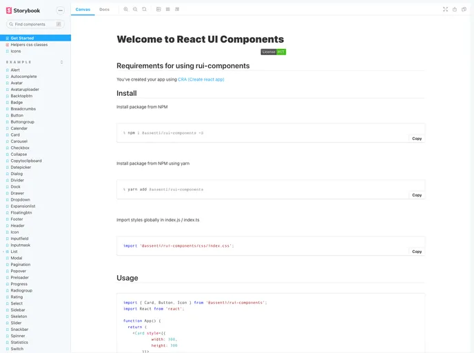
React UI Components (npm @assenti/rui-components)
Overview
The React UI Components is a collection of lightweight and reusable UI components for web applications built on React. The main goal of this library is to provide developers with a wide range of useful components that can be easily integrated into their projects.
Features
- Lightweight: The UI components in this library are designed to have a minimal impact on performance and resource usage.
- Reusable: Each component is built to be highly reusable, allowing developers to easily incorporate them into different parts of their applications.
- Compatible with Create React App: The components are compatible with apps created using Create React App (CRA), making it easy to integrate them into existing projects.
- Storybook Integration: The library provides integration with Storybook, allowing developers to explore and interact with the components in a isolated environment.
Summary
The React UI Components library offers a collection of lightweight and reusable UI components that are compatible with Create React App. With features such as high reusability and integration with Storybook, it provides developers with a convenient way to enhance the user interface of their web applications.
- React
React is a widely used JavaScript library for building user interfaces and single-page applications. It follows a component-based architecture and uses a virtual DOM to efficiently update and render UI components
- SCSS
SCSS is a preprocessor scripting language that extends the capabilities of CSS by adding features such as variables, nesting, and mixins. It allows developers to write more efficient and maintainable CSS code, and helps to streamline the development process by reducing repetition and increasing reusability.
- UI Kits & Components

A UI kit provides developers with a set of reusable components that can be easily integrated into a website or application. These components are pre-designed with consistent styling and functionality, allowing developers to save time and effort in the design and development process. UI kits can be either custom-built or third-party, and often include components for buttons, forms, typography, icons, and more.
- GitHub Pages

Gridsome is a Vue.js-based static site generator that makes it easy to build fast and flexible websites and applications by leveraging modern web technologies like GraphQL, Webpack, and hot reloading