Gov UI Kit
Implementation of the Aragon's Governance UI Kit
Overview
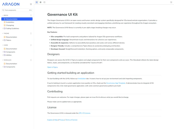
The Aragon Governance UI Kit is an innovative open source design system tailored for OSx-based onchain organizations. It stands out by offering a human-centric approach that prioritizes user experience, ensuring that all interfaces within the Aragon ecosystem are visually consistent and engaging. Currently in the pre-alpha stage, this UI Kit promises a robust framework for developers and designers alike, although users should be mindful of potential breaking changes during this phase.
Designed to facilitate streamlined governance workflows, the Governance UI Kit is a must-have for teams looking to create effective and appealing governance applications. Its extensive capabilities provide a solid foundation for enhancing collaborative efforts in decentralized organizations.
Features
- OSx-compatible: Comes equipped with pre-built components specifically tailored for Aragon OSx governance workflows, making integration seamless.
- Unified design language: Offers streamlined visuals and interactions to ensure cohesive user experiences across all applications.
- Accessible & responsive: Adheres to best practices in accessibility, ensuring that interfaces are easily navigable and functional on various devices.
- Designer-friendly: Includes a comprehensive Figma library, enabling swift prototyping and iteration of components for designers.
- Developer-focused: Features straightforward installation processes and theming options, complemented by easily composable components for developers.
- Component development support: Provides a thorough guide for starting development with the UI Kit, including setting up environments and importing components.
- Open for collaboration: Encourages contributions from the community, allowing for enhancements and discussions around major changes through an open pull request system.
- GPL-V3 License: Released under the GPL-V3 License, encouraging transparency and collaboration in development.
- React
React is a widely used JavaScript library for building user interfaces and single-page applications. It follows a component-based architecture and uses a virtual DOM to efficiently update and render UI components
- TanStack
TanStack is a collection of high-quality, framework-agnostic libraries including TanStack Query for data fetching, TanStack Router for routing, TanStack Table for tables, and more. These tools provide powerful, type-safe solutions for common web development challenges.
- Vite
Vite is a build tool that aims to provide a faster and leaner development experience for modern web projects
- Tailwind
Tailwind CSS is a utility-first CSS framework that provides pre-defined classes for building responsive and customizable user interfaces.
- UI Kits & Components

A UI kit provides developers with a set of reusable components that can be easily integrated into a website or application. These components are pre-designed with consistent styling and functionality, allowing developers to save time and effort in the design and development process. UI kits can be either custom-built or third-party, and often include components for buttons, forms, typography, icons, and more.
- Eslint

ESLint is a linter for JavaScript that analyzes code to detect and report on potential problems and errors, as well as enforce consistent code style and best practices, helping developers to write cleaner, more maintainable code.
- Framer Motion

Alpine.js is a lightweight JavaScript framework that simplifies the process of creating dynamic, reactive user interfaces on the web. It uses a declarative syntax that offers a higher level of abstraction compared to vanilla JavaScript, while being more performant and easier to use than jQuery.
- Postcss

PostCSS is a popular open-source tool that enables web developers to transform CSS styles with JavaScript plugins. It allows for efficient processing of CSS styles, from applying vendor prefixes to improving browser compatibility, ultimately resulting in cleaner, faster, and more maintainable code.
- Rollup

RollupJS is a popular and efficient JavaScript module bundler that takes the code from multiple modules and packages them into a single optimized file, minimizing the overall size of the application and improving its performance.
- Storybook
Storybook is a tool for developing and testing UI components in isolation. It provides a sandbox environment where you can experiment with different props and states to see how your component responds.
- Typescript

TypeScript is a superset of JavaScript, providing optional static typing, classes, interfaces, and other features that help developers write more maintainable and scalable code. TypeScript's static typing system can catch errors at compile-time, making it easier to build and maintain large applications.
- Vercel

Vercel offers built-in support for deploying and hosting Next.js applications, making it a popular choice among Next.js developers.
- React Hook Form

React Hook Form is a performant, flexible, and extensible form library for React with easy validation. It reduces re-renders and improves performance by using uncontrolled components and native HTML validation, making form handling simple and efficient.
- Zod

Zod is a TypeScript-first schema declaration and validation library. It allows you to define schemas that can validate data at runtime while providing excellent TypeScript inference, making it perfect for API validation, form validation, and type-safe data handling.