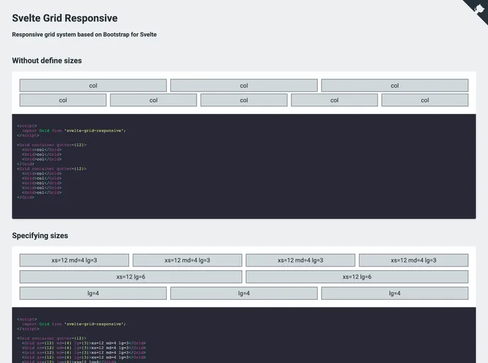
Svelte Grid Responsive
Responsive grid system based on Bootstrap for Svelte
Overview
Svelte Grid Responsive is an innovative grid system that leverages the popular Bootstrap framework, tailored specifically for Svelte applications. Designed to provide developers with a seamless and flexible solution, this grid system enhances the process of creating responsive layouts effortlessly. With its straightforward integration and user-friendly design, Svelte Grid Responsive is set to become a go-to tool for building modern web interfaces.
Features
- Bootstrap Compatibility: Built on top of the Bootstrap framework, ensuring familiarity for developers with Bootstrap experience.
- Responsive Design: Automatically adapts to different screen sizes, making it ideal for various devices from desktops to mobile phones.
- Flexible Configuration: Offers a range of customizable options to help tailor grid layouts to specific project needs.
- Lightweight: Keeps your application performance in check with a minimal footprint, avoiding unnecessary bloat.
- Easily Integrated: Simple installation and integration process that allows developers to get started quickly.
- Developer Friendly: Provides intuitive syntax and clear documentation, catering to both novice and seasoned developers.
- Custom Breakpoints: Enables the use of custom breakpoints for even more precise layout control.
- Svelte
Svelte is a modern front-end framework that compiles your code at build time, resulting in smaller and faster applications. It uses a reactive approach to update the DOM, allowing for high performance and a smoother user experience.
- Bootstrap
Bootstrap is the most popular CSS Framework for developing responsive and mobile-first websites.