Andore UI
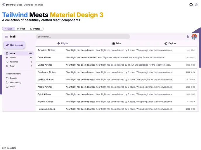
A collection of react components that implement the Material Design 3 guidelines using Tailwind CSS.
Overview
Andore/ui presents an exciting collection of React components crafted with a keen eye for detail, adhering closely to Material Design 3 guidelines. Leveraging the power of Tailwind CSS, this project provides developers with a refreshing toolkit that encourages creativity and experimentation. While it is still a work in progress and meant primarily for educational use, it offers unique insights into the latest trends in UI design.
As a React developer, diving into this project may ignite your passion for crafting intuitive interfaces. The collection is designed to facilitate the implementation of Material Design's principles, allowing you to create applications that are not only visually appealing but also user-friendly.
Features
- Tailwind CSS Integration: Built using Tailwind, providing straightforward styling and customization options for a seamless development experience.
- Material Design 3 Guidelines: Each component is meticulously designed to align with the latest Material Design standards, offering a modern aesthetic.
- Easy Installation: Simplify your setup with straightforward commands to install all components or select specific ones based on your needs.
- Documentation Available: Comprehensive documentation is provided, making it easy to navigate and understand the usage of each component.
- Learning Resource: Primarily intended for educational purposes, this collection serves as an excellent tool for experimenting with the newest materials and techniques in UI design.
- Work in Progress: Being a project under development, it offers developers a chance to contribute and influence its growth while learning about modern design practices.