UI Kit.ai
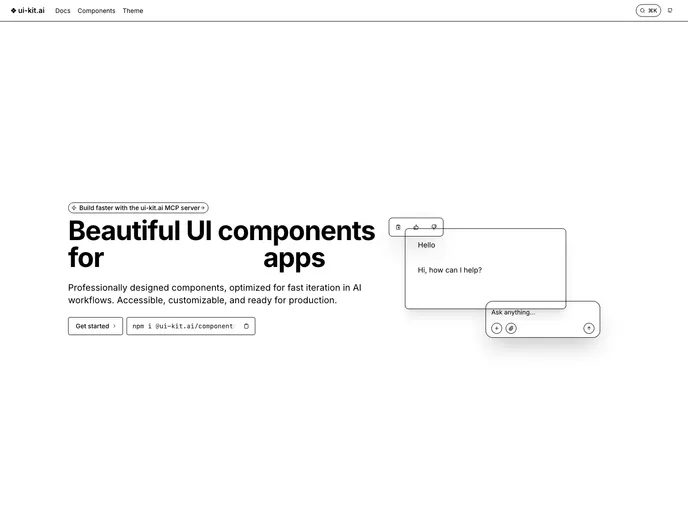
Beautiful UI components for AI-powered apps
Product Analysis: Boondoggle.design
Overview:
Boondoggle.design is a collection of CSS components and utilities aimed at making the process of building UIs in React faster and more efficient. This product offers a simplified set of components and a unified set of utility CSS "sprinkles", allowing for type-safe and inline styling in a React-like manner. By utilizing pre-processed vanilla CSS and popular libraries like Radix UI, Downshift JS, and React Hook Form, Boondoggle strives to provide a complete and polished UI with minimal bundle footprint.
Features:
- Opinionated Component Library: Boondoggle offers a simplified and opinionated set of components that abstract the repetitive and slow aspects of UI building.
- Utility CSS "Sprinkles": The product introduces a unified set of utility CSS "sprinkles" that can be used in conjunction with any component, enabling type-safe and "Tailwind-like" inline styling.
- Compatibility with Popular Libraries: Boondoggle makes use of battle-tested open-source libraries like Radix UI, Downshift JS, and React Hook Form to provide comprehensive coverage and robust functionality.
- Simple and Lightweight: The focus of Boondoggle is to provide a minimal bundle footprint while ensuring a smooth developer experience.
Summary:
Boondoggle.design is a product that simplifies and accelerates the process of building UIs in React. It offers a set of opinionated components, a unified set of utility CSS "sprinkles", and compatibility with popular libraries to provide a complete and polished UI with minimal bundle size. With a focus on simplicity and efficiency, Boondoggle aims to enhance the developer experience and reduce the time spent on repetitive UI tasks.