Material UI Slider
Material-UI 1.0.0 Slider component
Overview
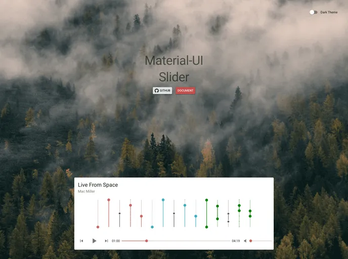
The Slider for Material-UI 1.0.0 is an intuitive and versatile component designed to enhance user interaction within your application. Serving as a graphical control element, this slider allows users to select a value or range of values easily, making it ideal for settings adjustments and other parameter selections. Whether you're building a complex data visualization tool or a simple settings menu, this component fits seamlessly into your design.
Equipped with a variety of customization options and robust functionality, this slider stands out for its user-friendly interface and adaptability to different use cases. The ability to specify minimum and maximum values, customization of color, and range selection make this slider a highly customizable option for developers looking to create a more engaging user experience.
Features
- Min and Max Values: Set the minimum value as low as 0 and a maximum of 100, ensuring control over the slider range.
- Default Value: Initialize the slider with a default value or range, which can be a single number or an array for ranges.
- Customizable Decimals: Control the precision of the output with settings that allow for a specific number of decimal places.
- Range Selection: Enable a range selection mode by simply passing an array, perfect for cases where users want to choose between two values.
- Direction Flexibility: Choose between horizontal and vertical orientations to fit the layout of your application.
- Color Customization: Personalize the slider’s appearance with colors specified in HEX, RGB, or HSL formats.
- Event Callbacks: Utilize onChange and onChangeComplete functions to track when the value changes, enhancing interactivity within your app.
- React
React is a widely used JavaScript library for building user interfaces and single-page applications. It follows a component-based architecture and uses a virtual DOM to efficiently update and render UI components
- Material UI
material-ui adds classes to Tailwind CSS for all common UI components. Classes like btn, card, etc. This allows us to focus on important things instead of making basic elements for every project.
- Eslint

ESLint is a linter for JavaScript that analyzes code to detect and report on potential problems and errors, as well as enforce consistent code style and best practices, helping developers to write cleaner, more maintainable code.
- Prism JS

PrismJS is an open-source, lightweight, and extensible syntax highlighting library that supports a wide range of programming languages and markup formats.